Welcome to my Portfolio
take a look around
Brand Identity/Logos
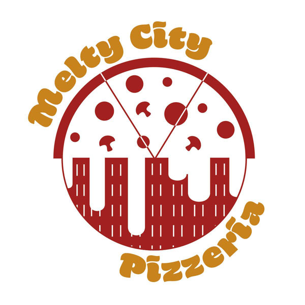
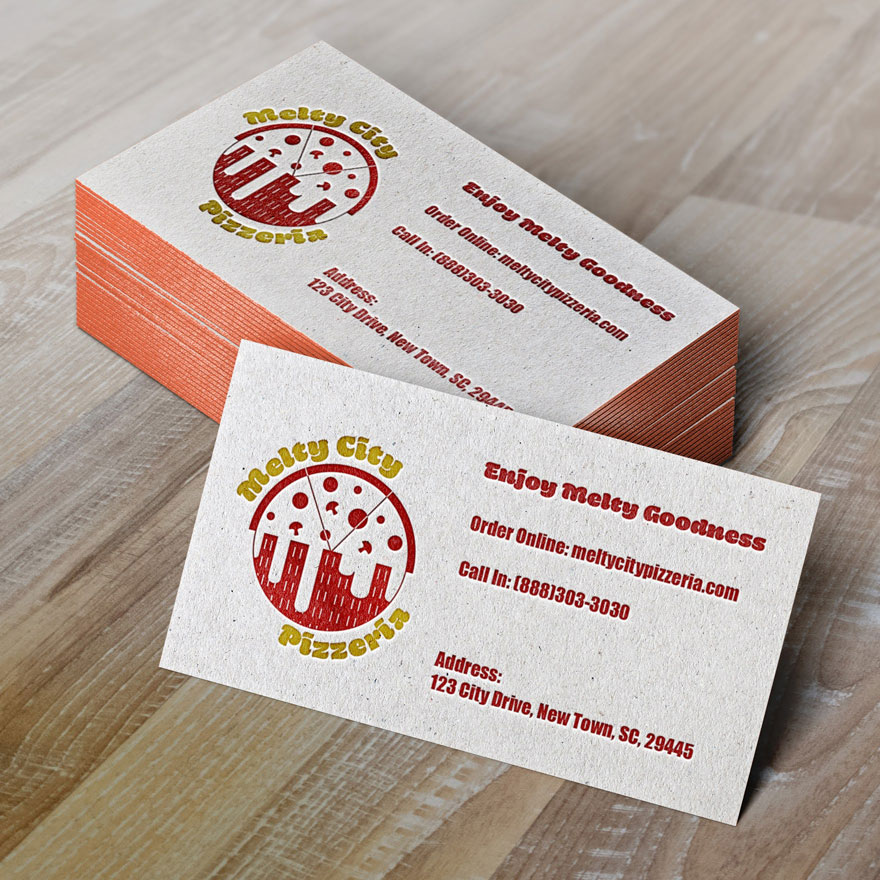
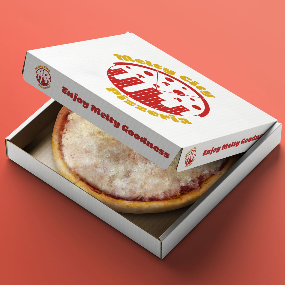
Melty City Pizzeria Logo
I asked my followers for some random words on Instagram to give me some ideas of new logo designs so I could practice. The word "pizza" came through, so I spent time studying pizza logos and coming up with my own, creating Melty City Pizzeria. I wanted to combine the skyline with a pizza, keeping the circular shape.
Yoga Logo
When a client comes to me in need of a logo, I try to get as much information about the type of business they will have and about the pesron themselves. With my knowledge of favorite poses, flowers, and colors, I went with a soft, feminine sort of logo with the colors and organic shapes.
Faith and Learning Institute
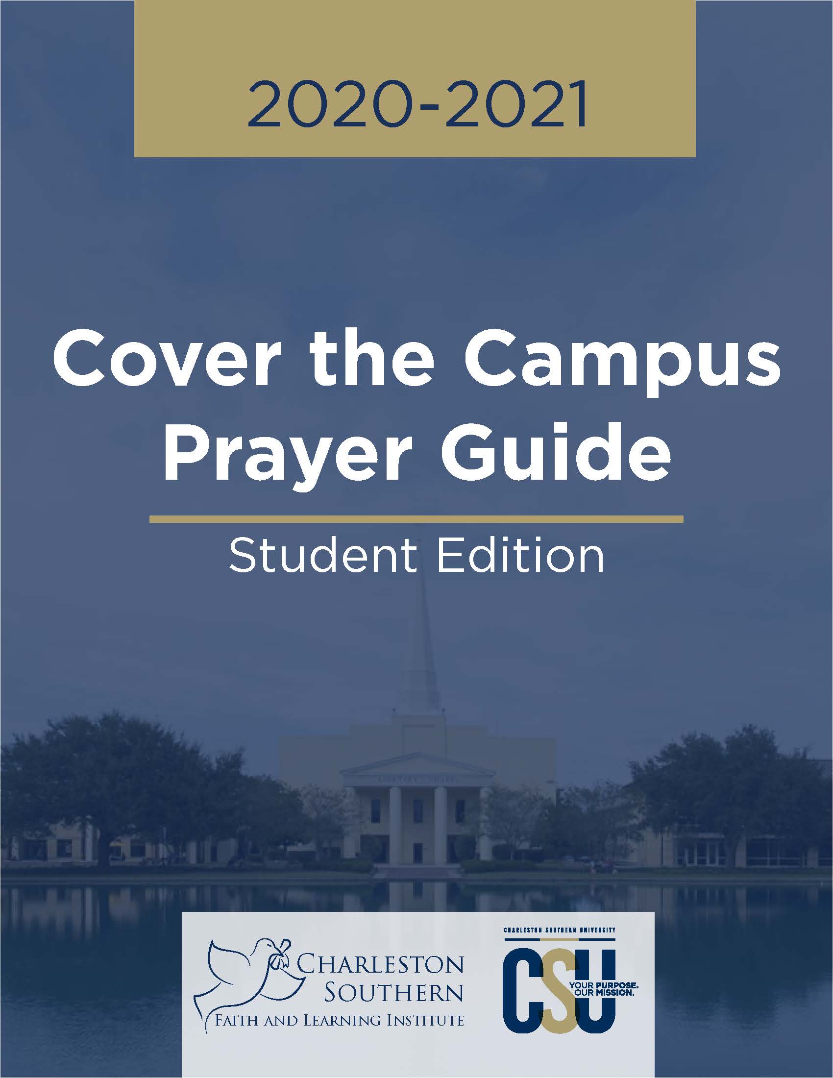
Charleston Southern University's new Faith and Learning Institute wanted a logo that suited the school, but also spoke their message of faith and learning. They told me they were very interested in the idea of a dove with it's wings spread, so I took that idea like that of Noah's Ark, and replaced the olive branch with a diploma.
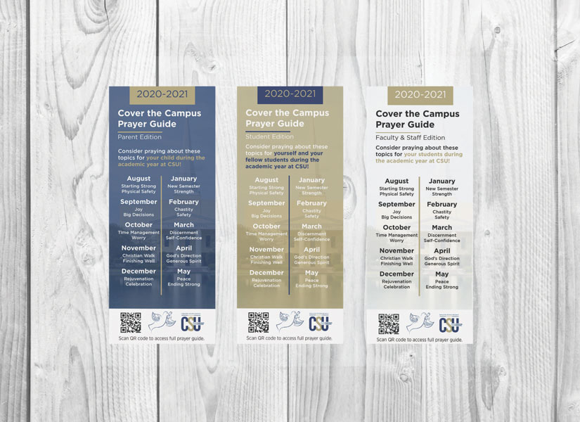
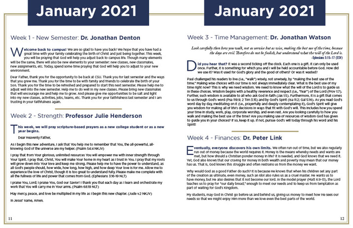
Afterwords, I worked alongside the Institute to create Cover the Campus bookmarks and prayer guides for the following school year.
Salon Rebranding
When going into a rebrand, I take a look at what they currently have and learn more about the company in order to see where improvements need to be made. For this company, I wanted something that portrayed more towards their female clients and match an icon logo that fit the type of styling they do for their clients.
Groomer's Logo
When it came to redesigning this logo for Professional Pet Grooming and Boarding, I thought, what wouldn’t be a better subject than my own pet who goes there? Taking inspiration from my pet and the idea of how women wrap their hair up in towels, I illustrated this cute pup with her ears up in a towel and took inspiration from the shape of bubbles to frame the text around the pup.
Bridal Boutique Brand
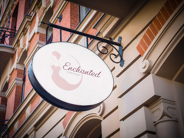
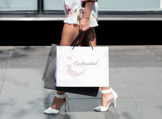
I wanted to challenge myself with a more feminine logo where I personally pull myself away from my usual color palette and try something new. The idea of a bridal boutique interested me, so I made up a brand and worked on a more elegant looking logo, using softer feminine pinks that I would not typically use.
CSU 2020 Spring Symposium
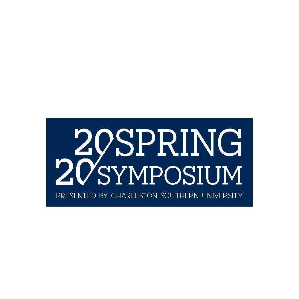
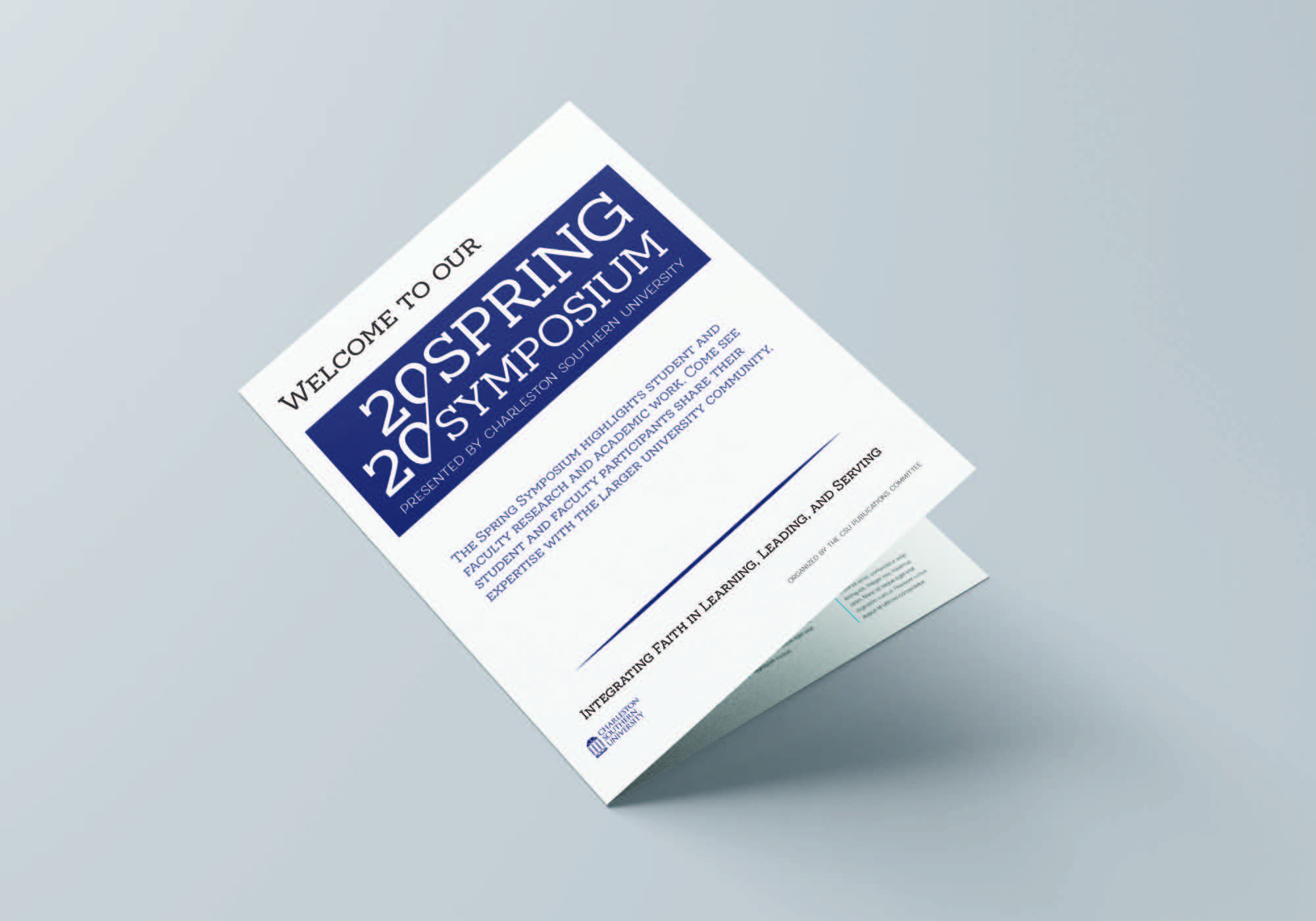
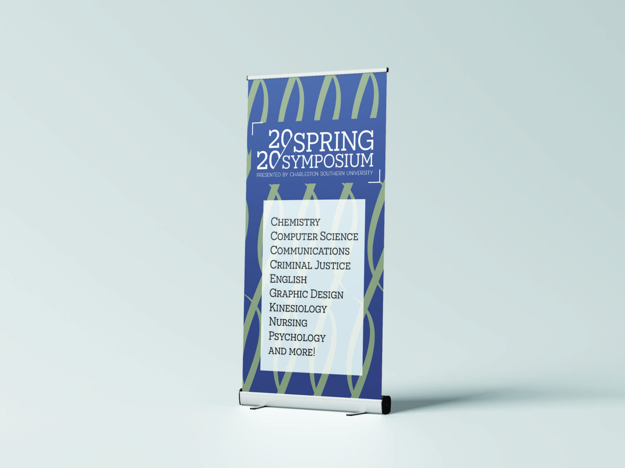
Before Covid-19 changed the plans, I was working on Charleston Southern University's 2020 Spring Symposium logo and collateral. With the logo, I loved how symmetrical 2020 was so I played off cutting a piece of it off in an angle, keeping the design of the entire piece straight edged and rectangular. We never got to finish the collateral designs due to the pandemic, but either way I mocked up a couple of ideas that we had in mind.
Website Design
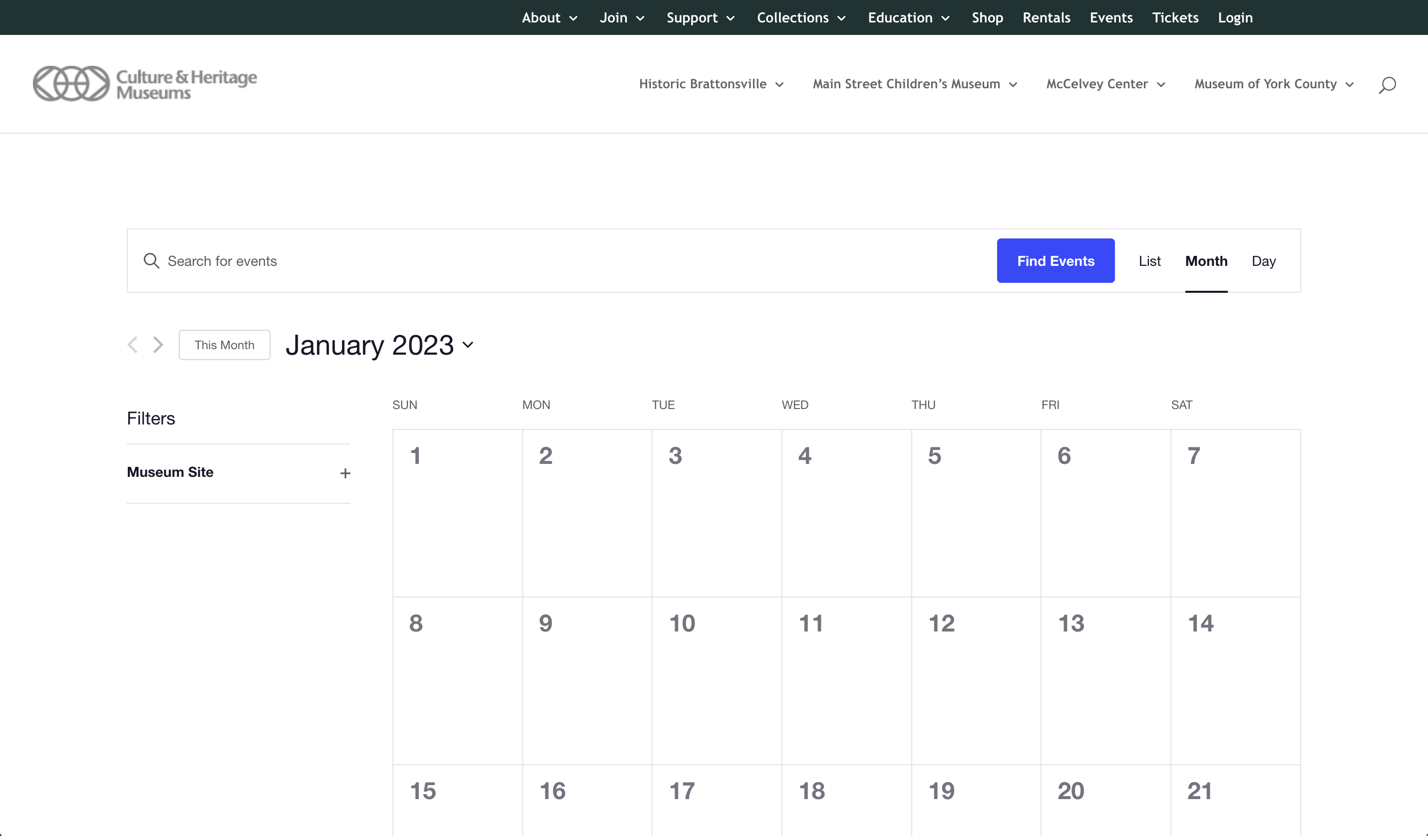
Culture & Heritage Museums
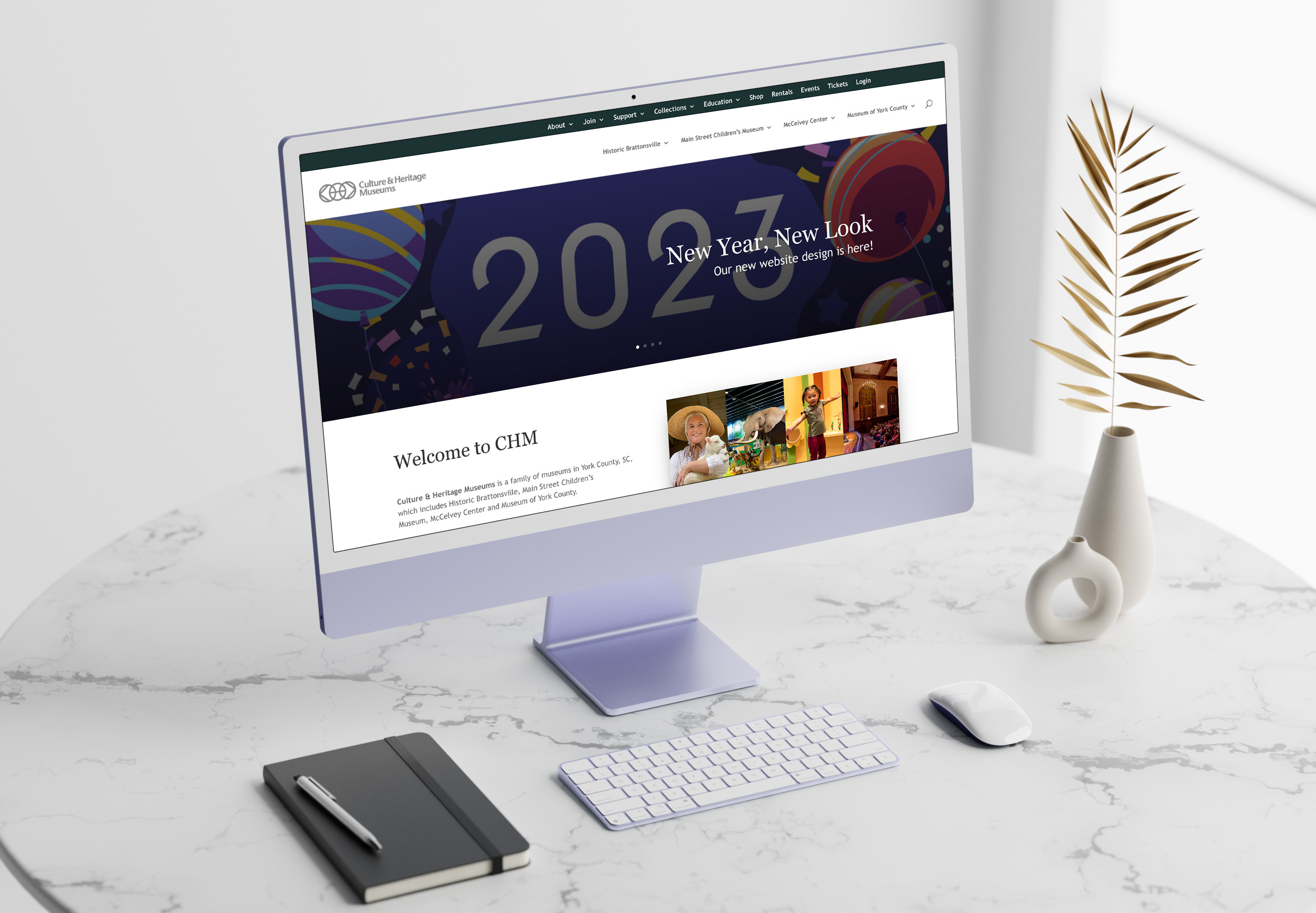
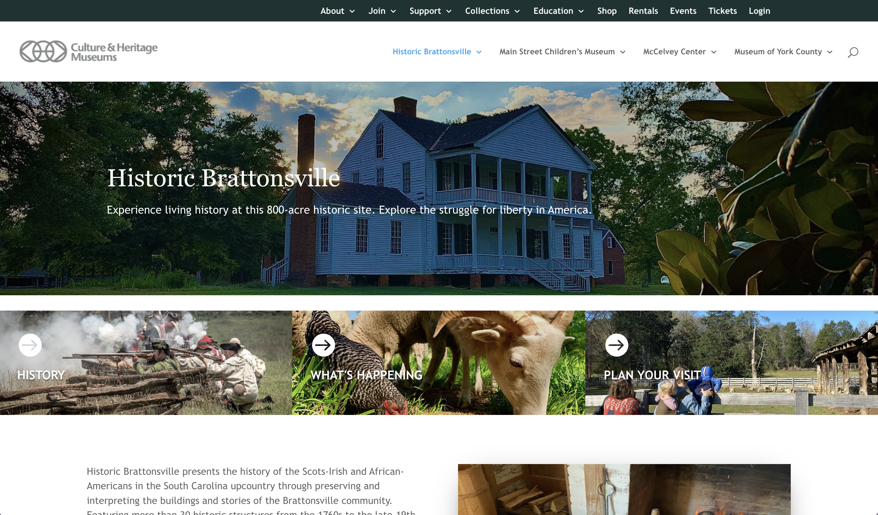
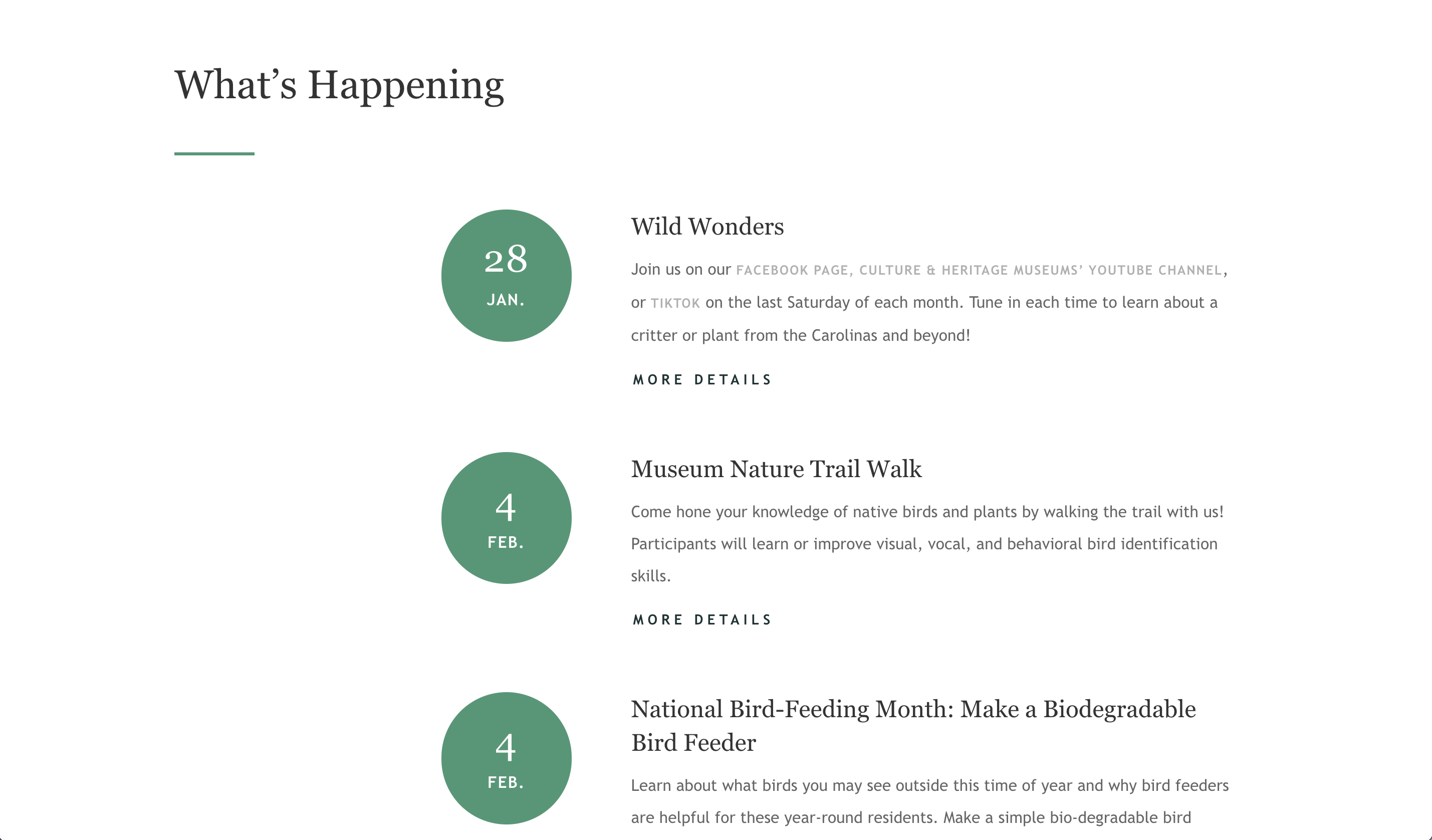
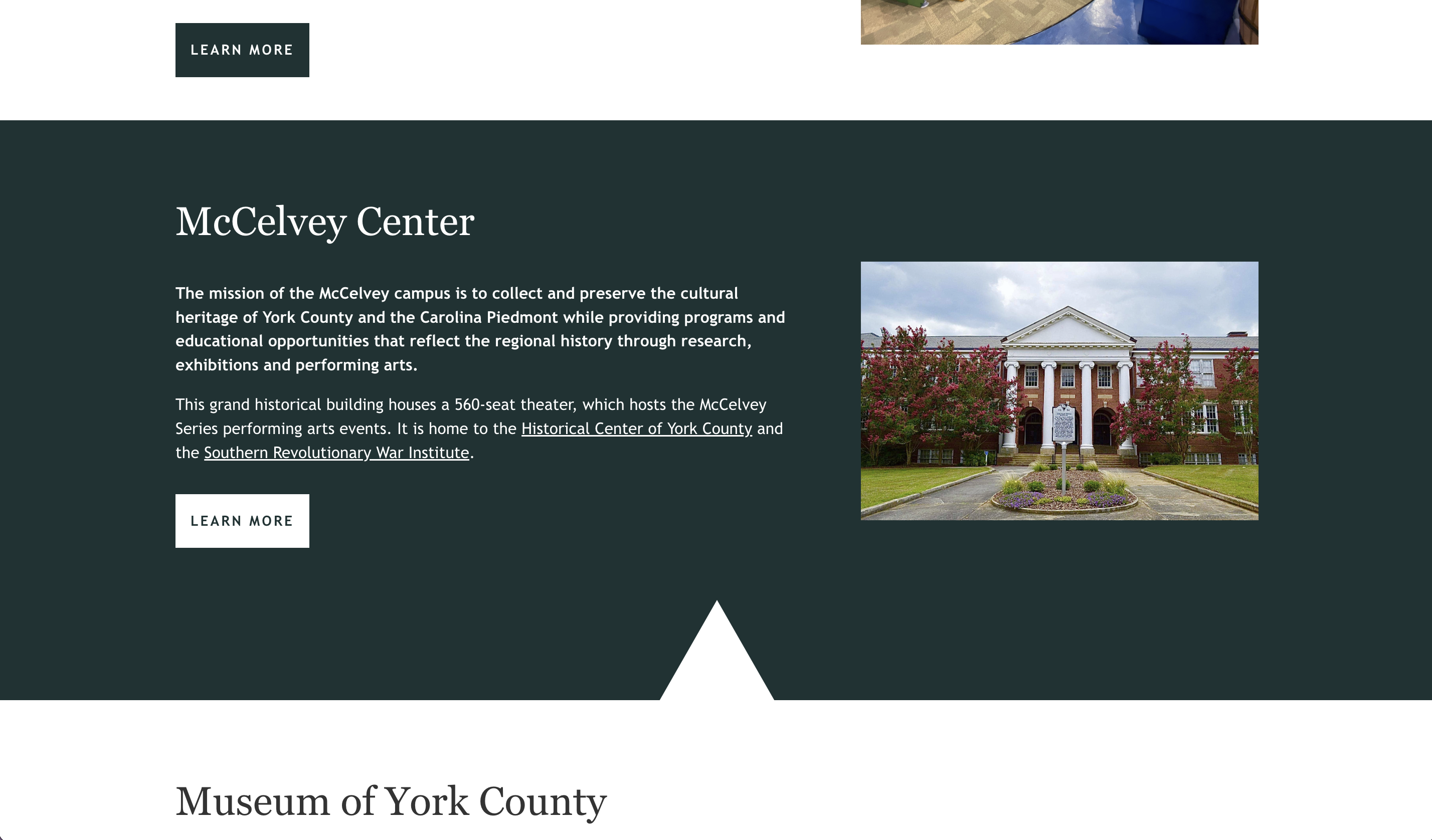
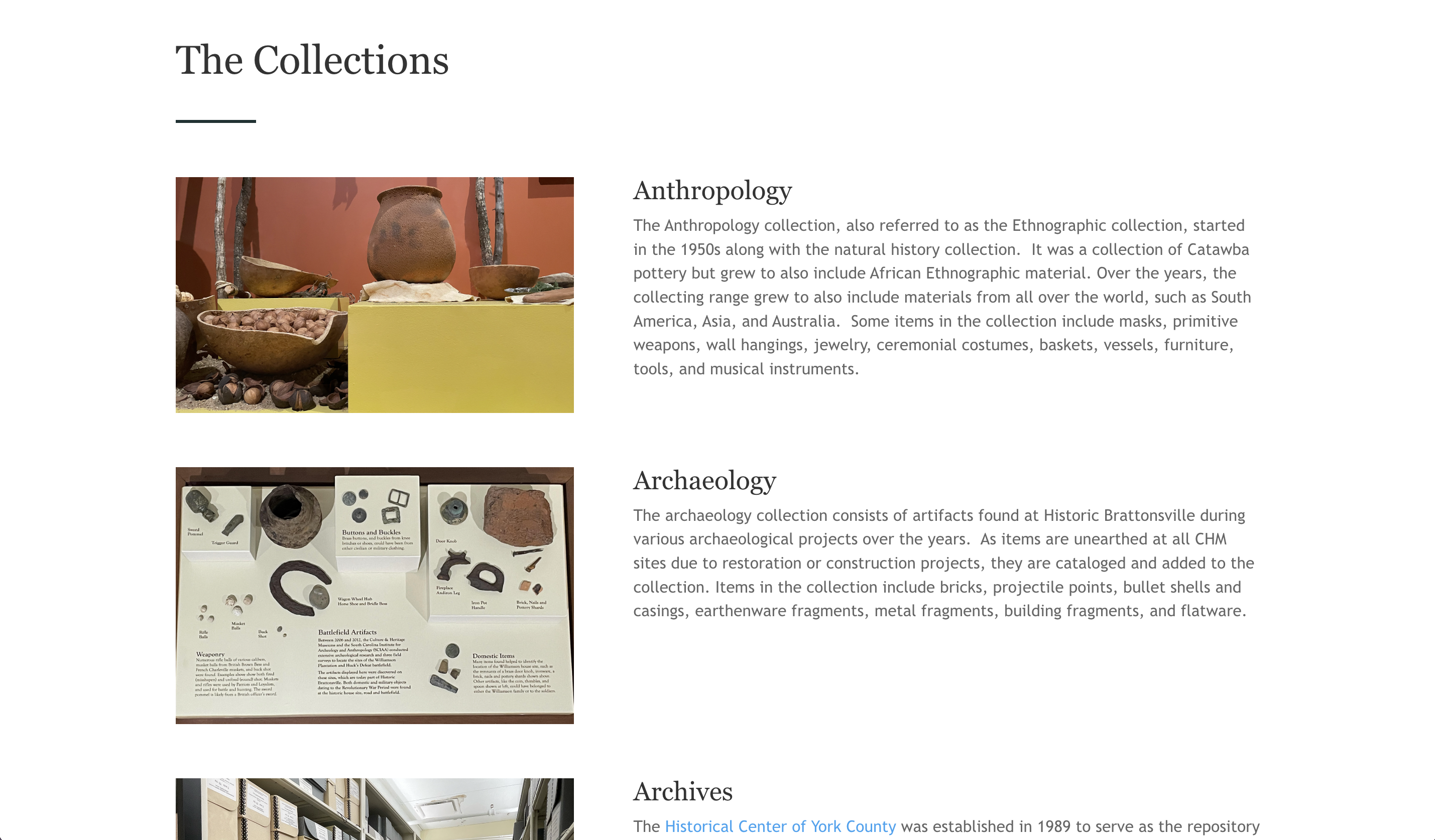
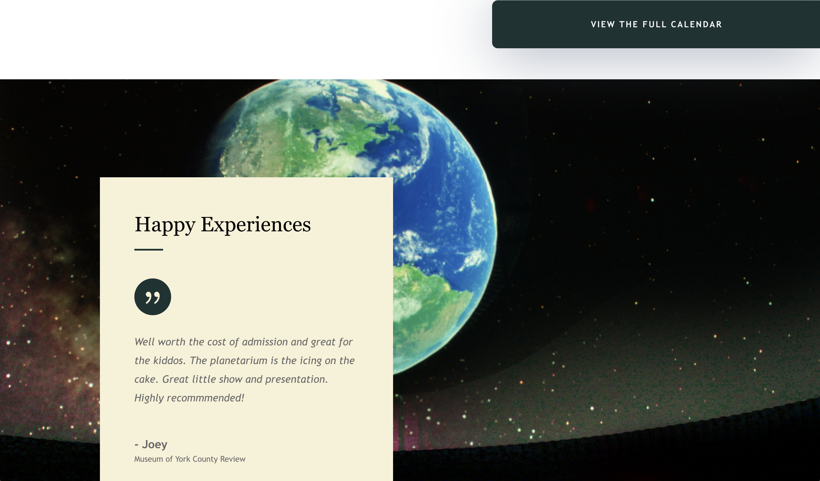
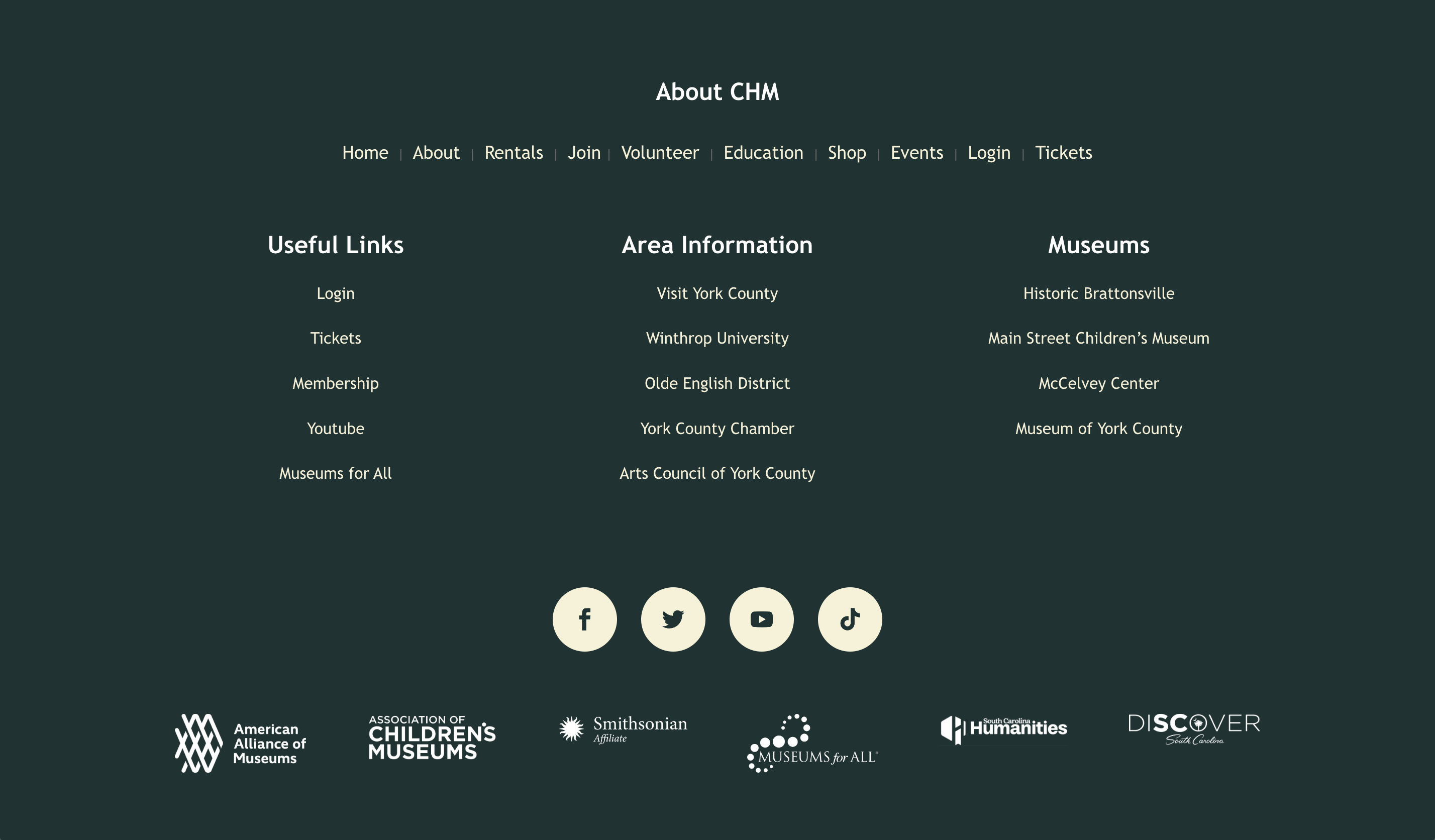
This family of museums located in York County, SC was looking to update their website's appearance to match their new brand guidelines. Working with their team, while updating the look to be more fun and colorful, we also worked on condensing many of the pages that were transferred over for an easier navigation system. They also hoped to have a better event feature on their site to display their events on a list or a calendar, so with some research I helped them find an easy to use plugin that when they create an event, it automatically updates in their site's calendar.
Site: https://chmuseums.org/
The Final Four is Not on the Schedule
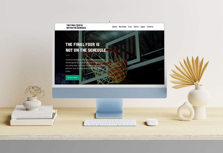
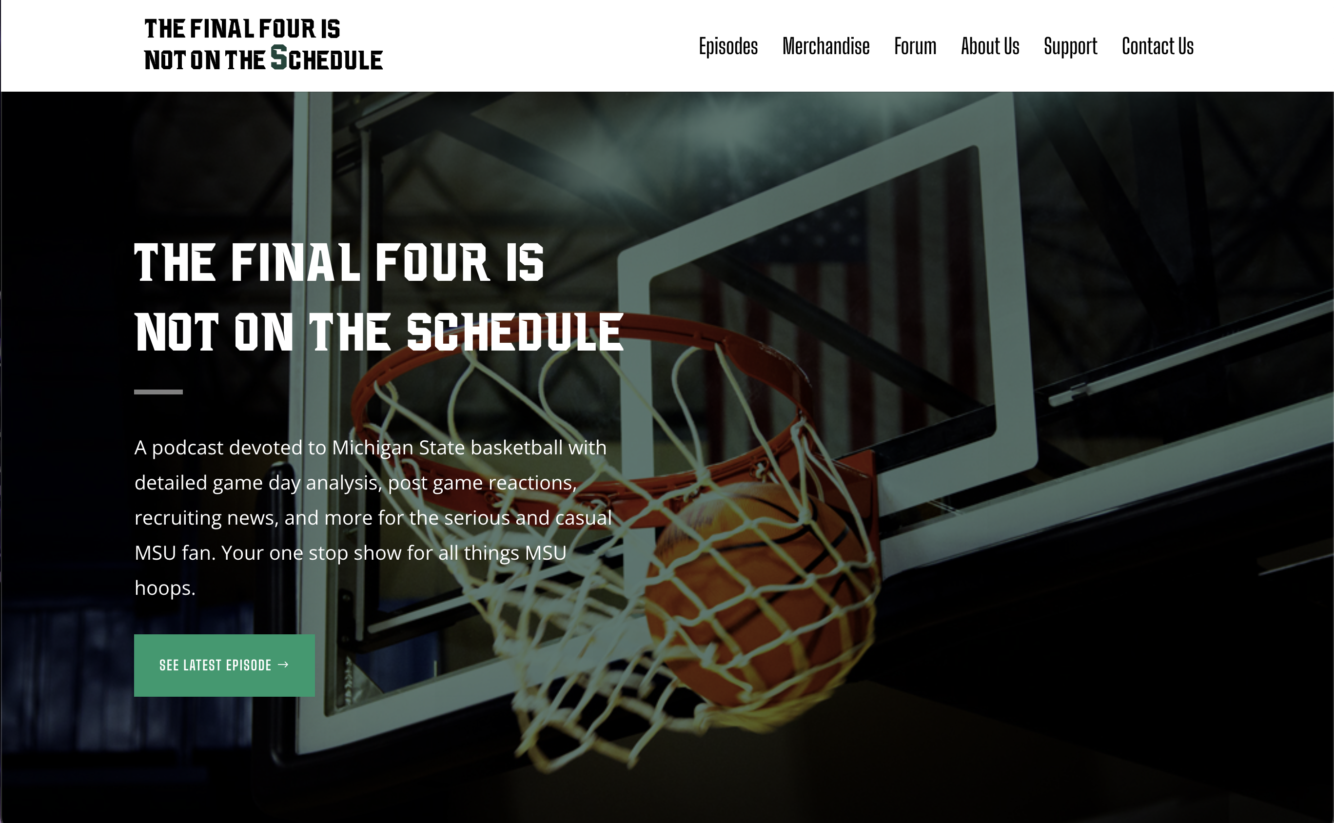
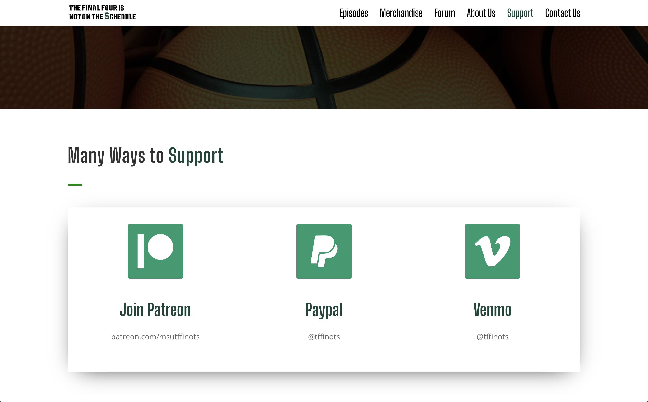
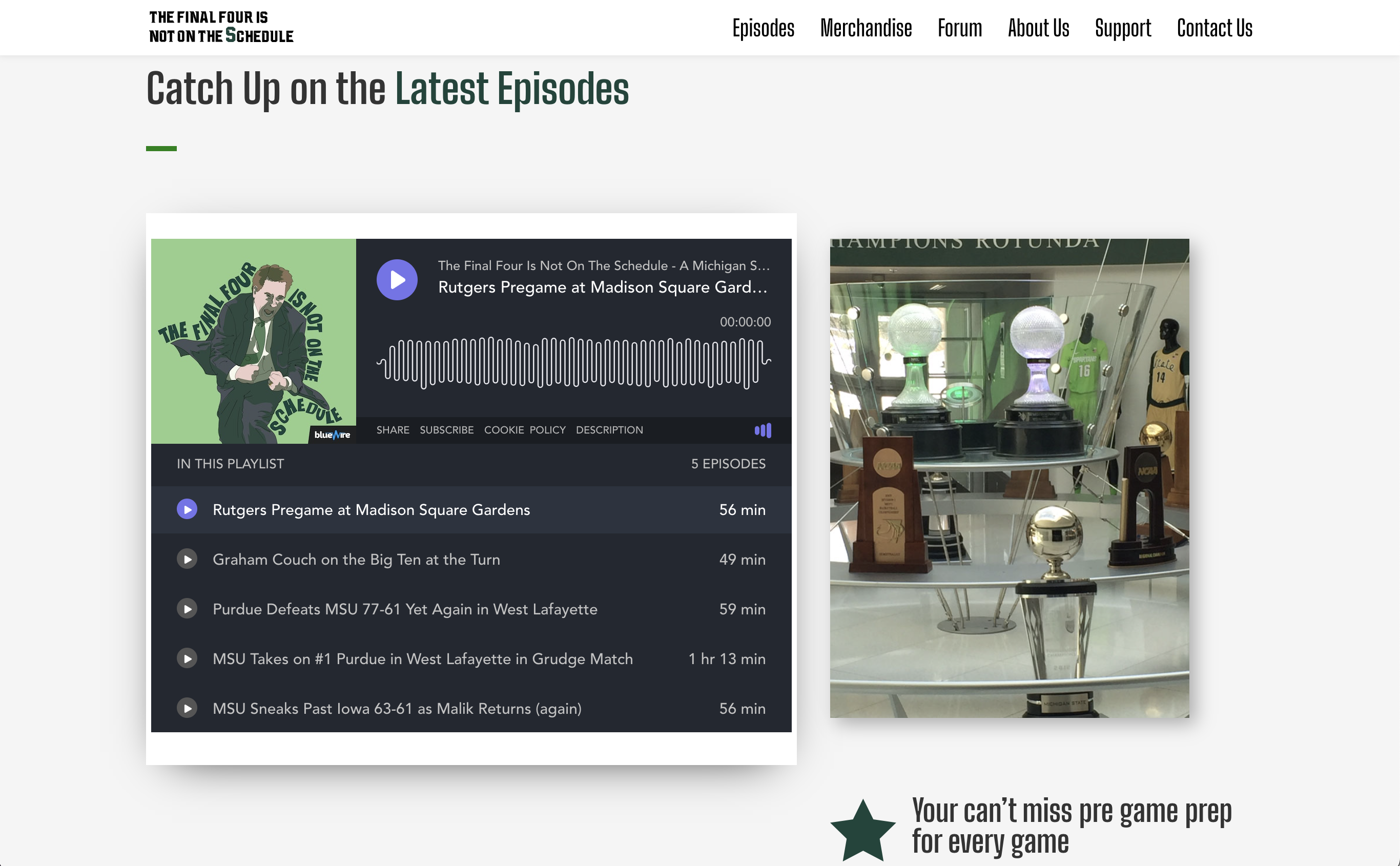
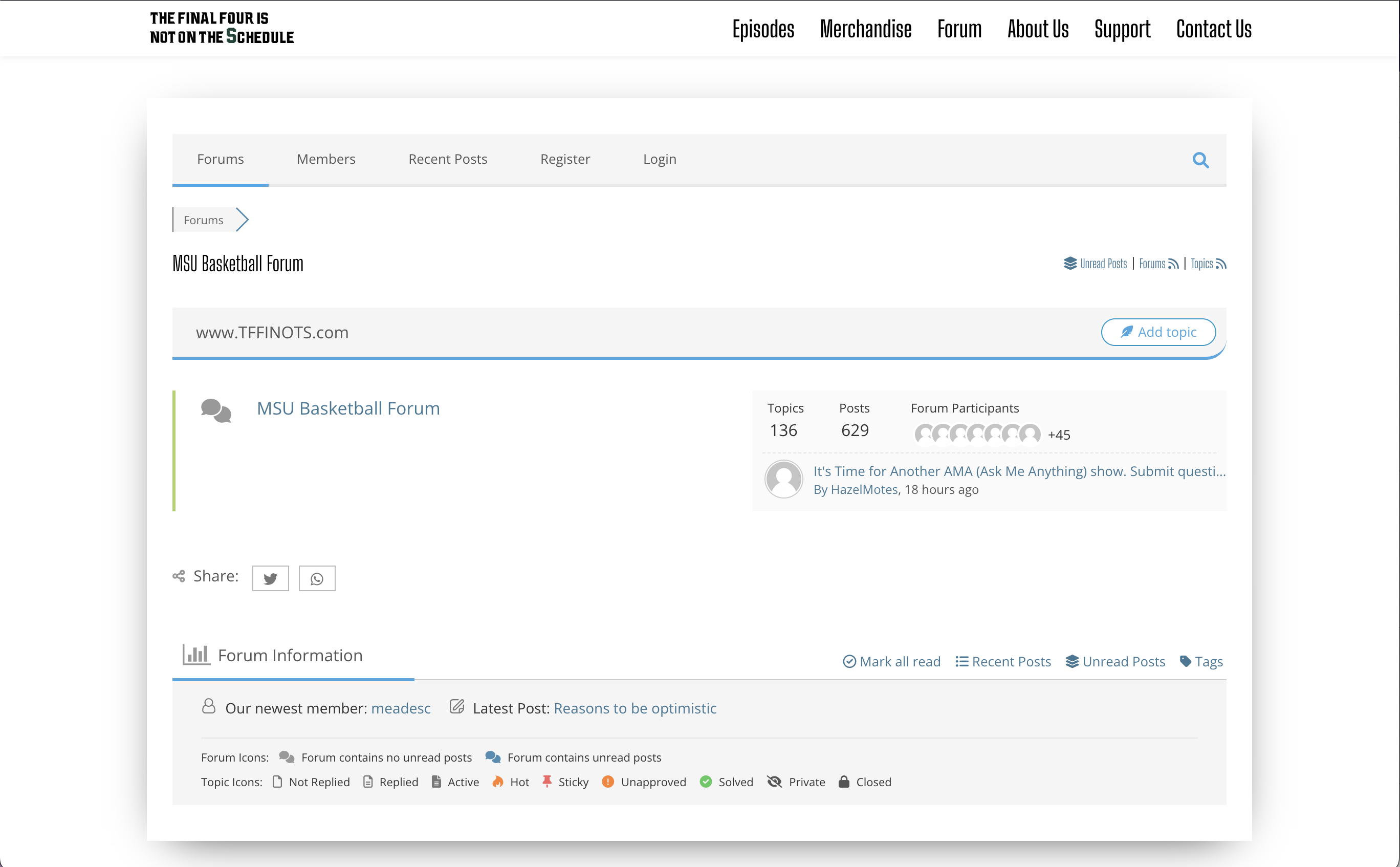
This podcast for Michigan State's Basketball team was looking to have a website to host their podcast on as a central home, with features that included donating to the podcast and a public forum fans could sign up to and have discussions on the latest news of the team. Using the Spartan's branding of greens, we implemented them through out fun features on the site, as well as used fun background elements of slants to pull a sport-like look.
Site: https://tffinots.com/
Haven Spine + Pain
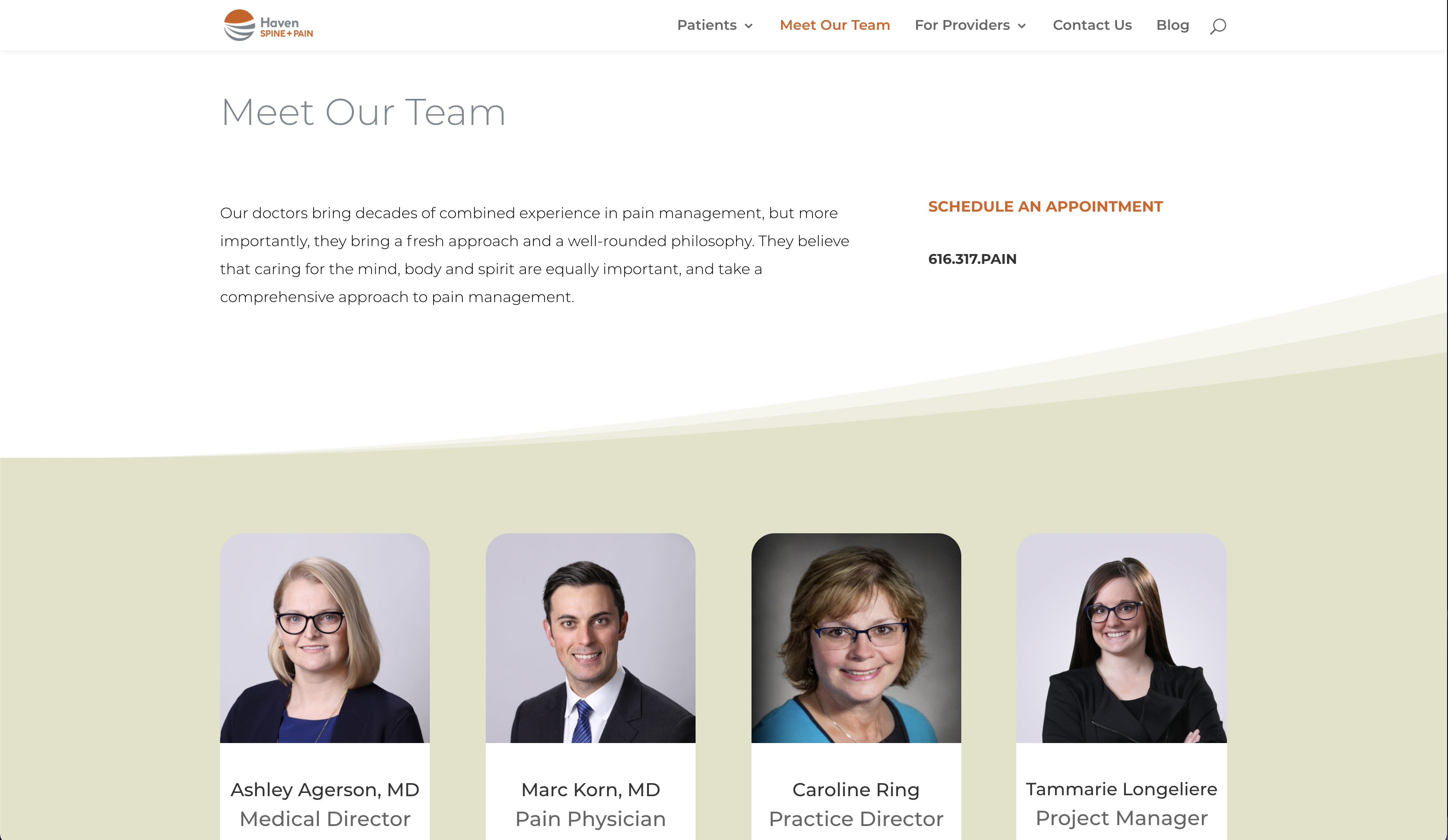
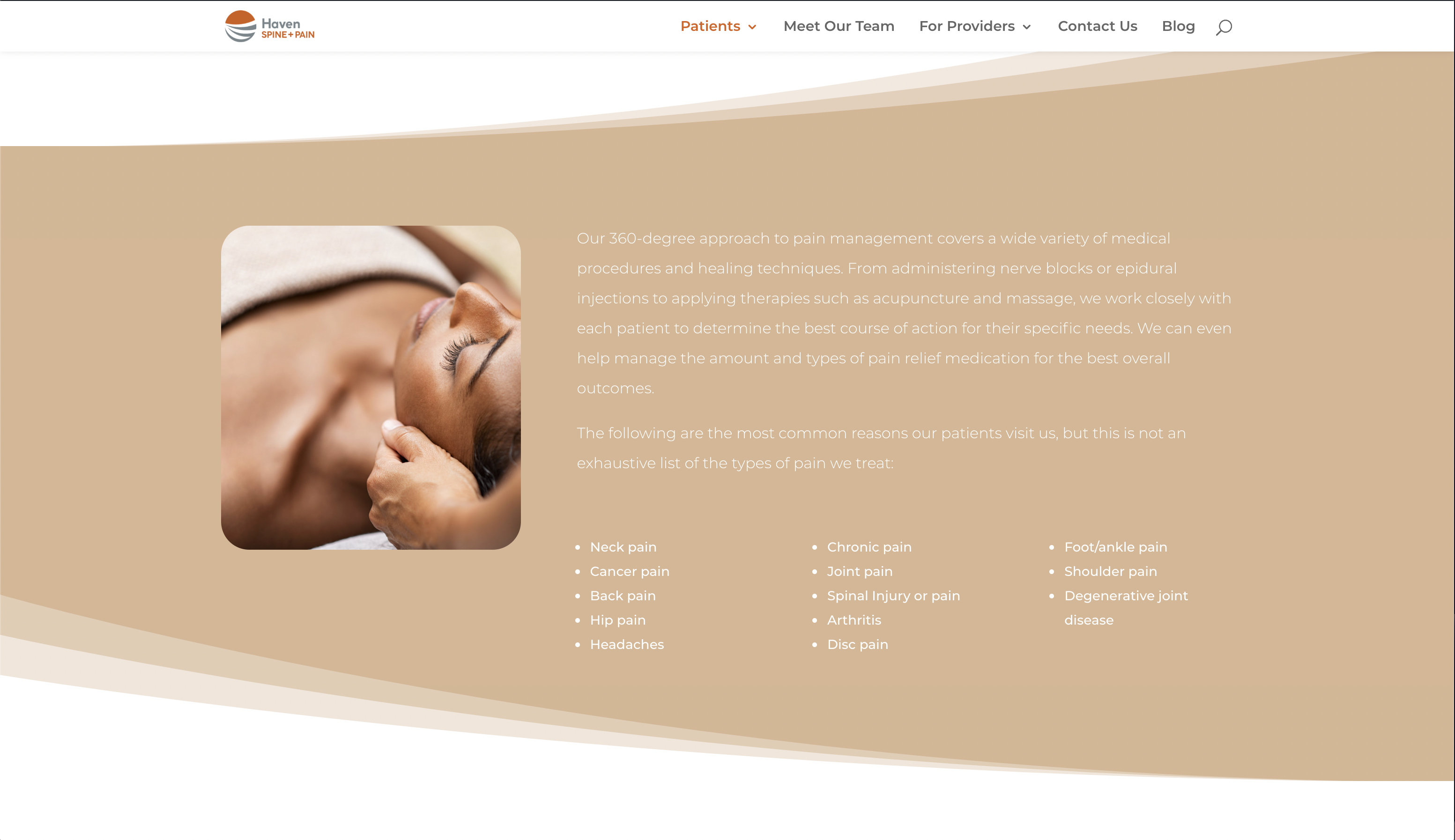
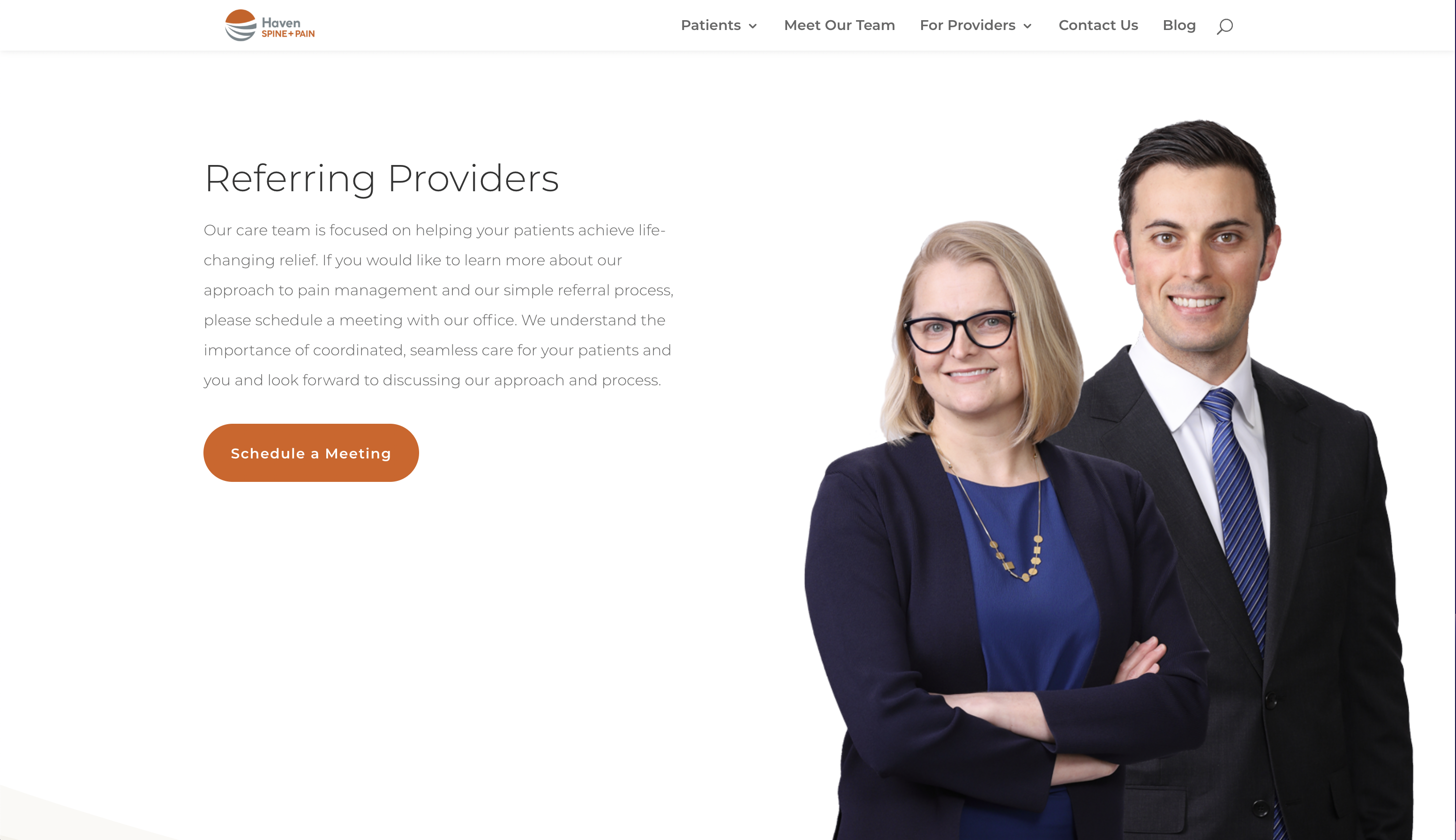
With this new website, the clients wanted the site to match the calm and smooth feeling their brand brings across. They also really liked simplicity, so I implemented soft curves that flow down the page as well as soft colors that fit their brand and their profession.
Site: https://havenpain.com/
Claxton Elementary Samet411
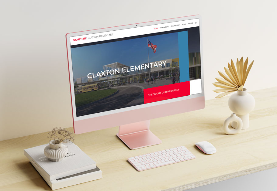
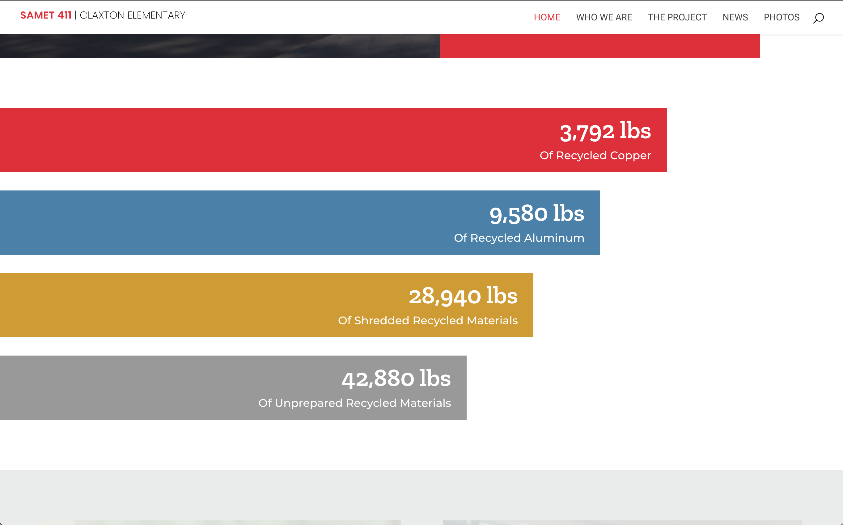
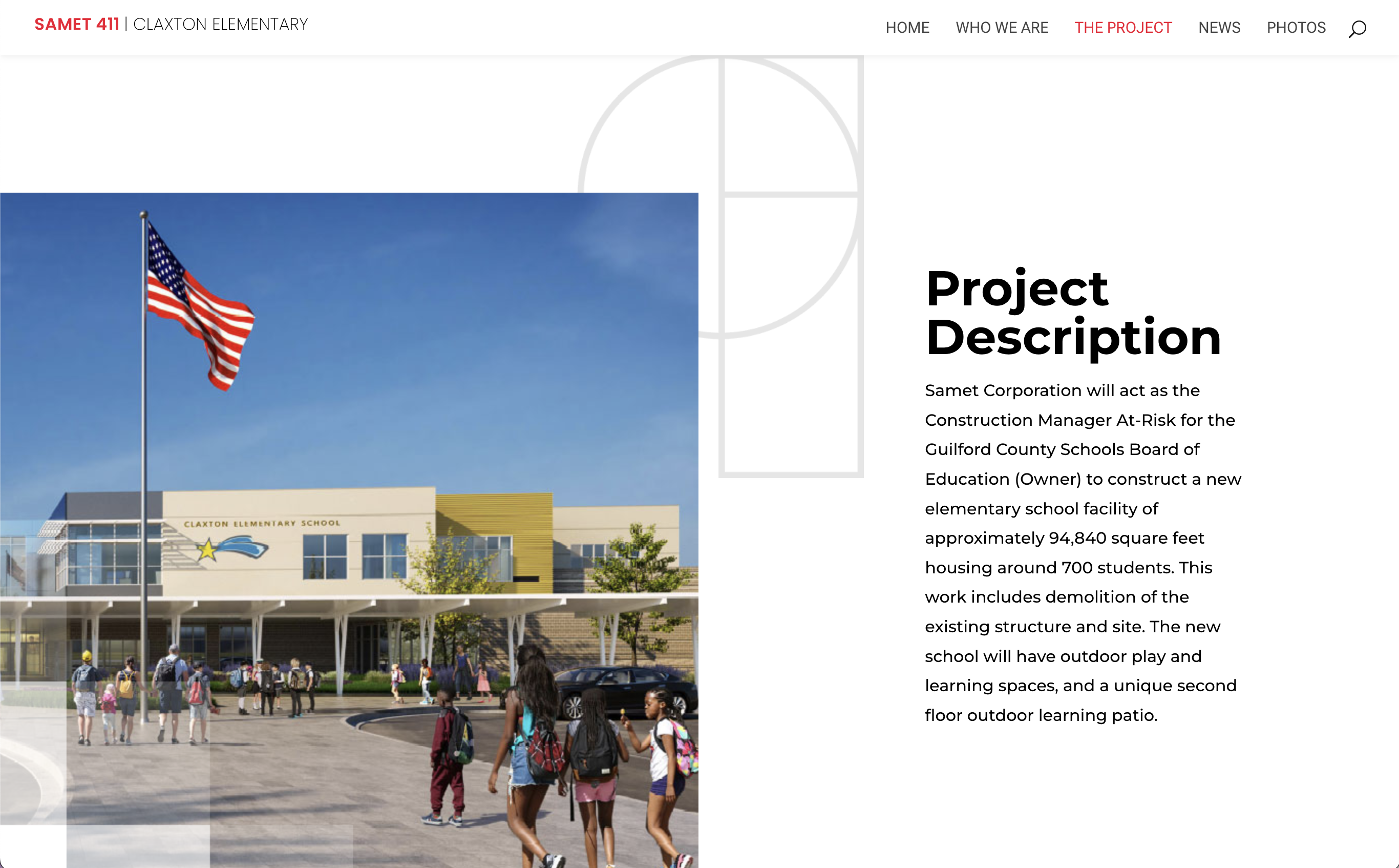
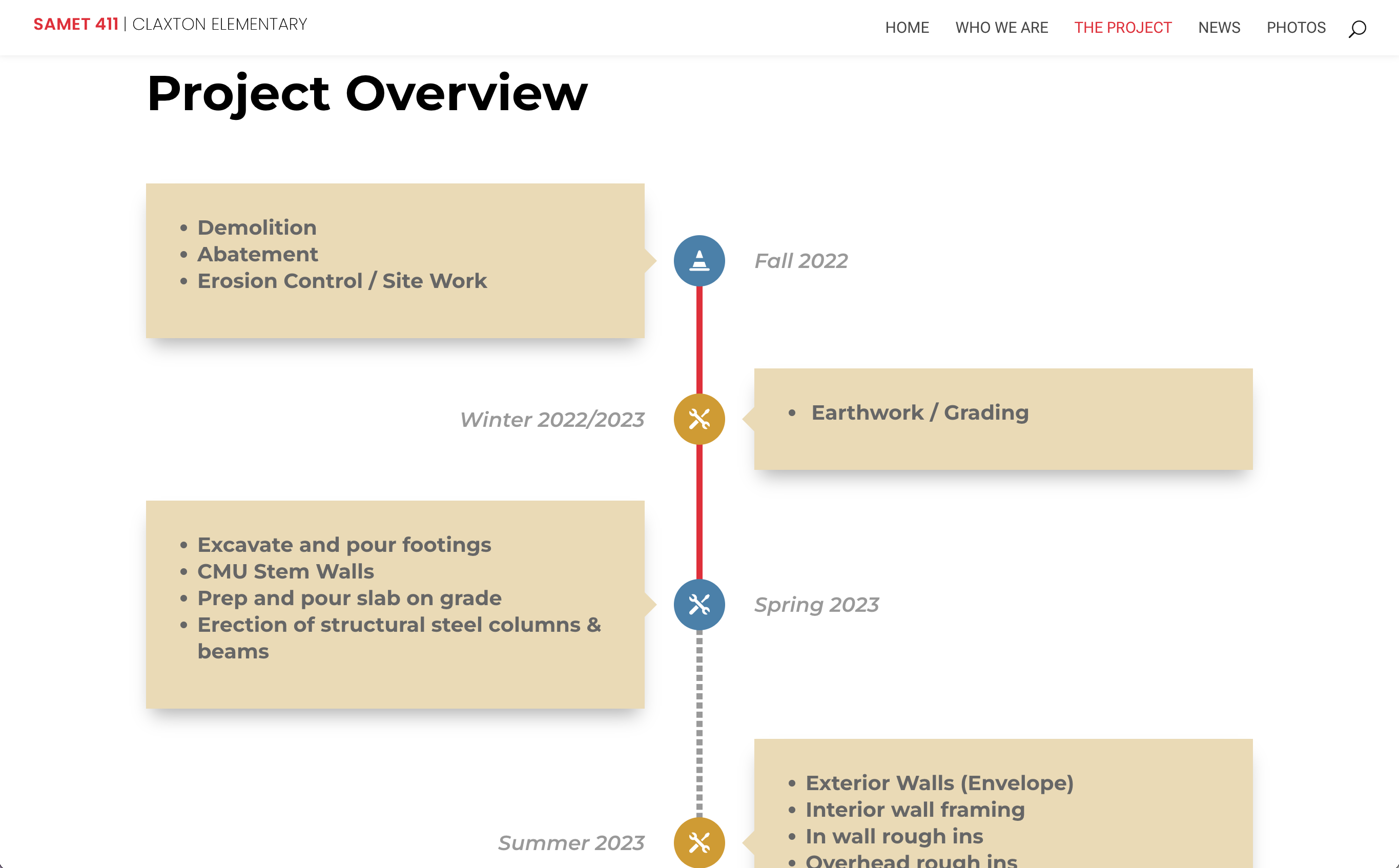
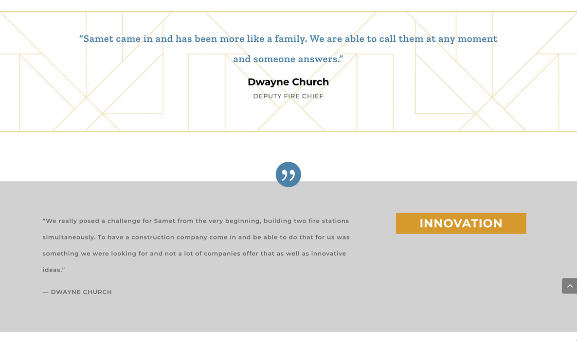
Samet411 was in need of a template design to use for certain projects they were highlighting with timed updates and followed through blogs. We started with Claxton Elementary, where I laid out interesting but simple, fun designs that went with the Samet branding, but accomplished the needs of the template that it will be easy to use for future projects.
Site: https://claxton.samet411.com/
Samet Corp.
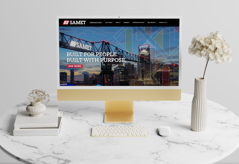
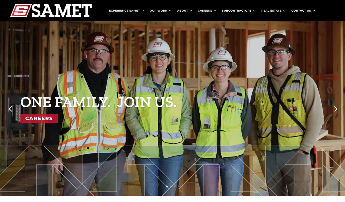
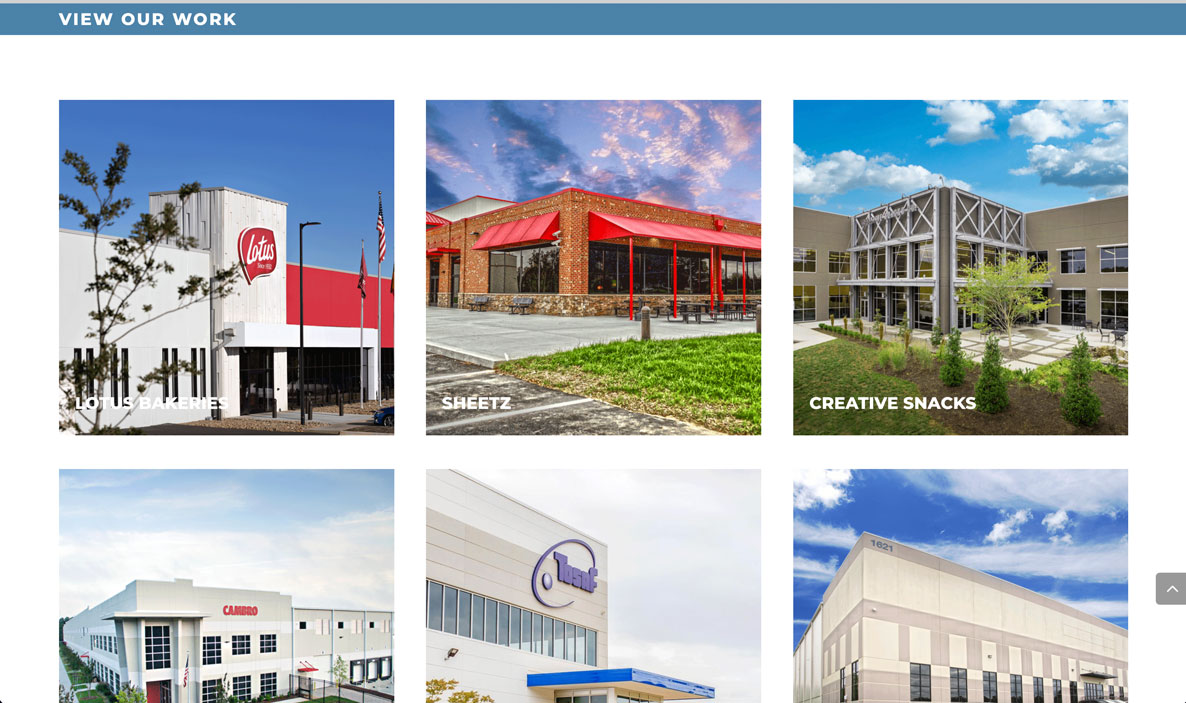
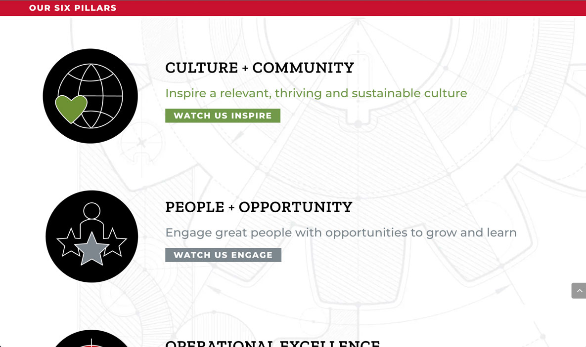
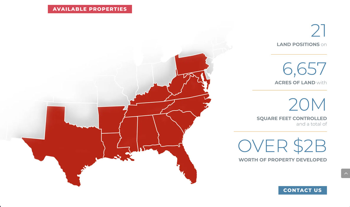
This construction and real estate company needed a new look to their website, and it was a task to accomplish. Many pages needed to be transferred over and added, as well as a completely new design. Working with their team to create a new look that better suited the company, while also making the site user friendly for when their team had to take over, many challenges were found but overcome to create a professional site.
Site: https://sametcorp.com/
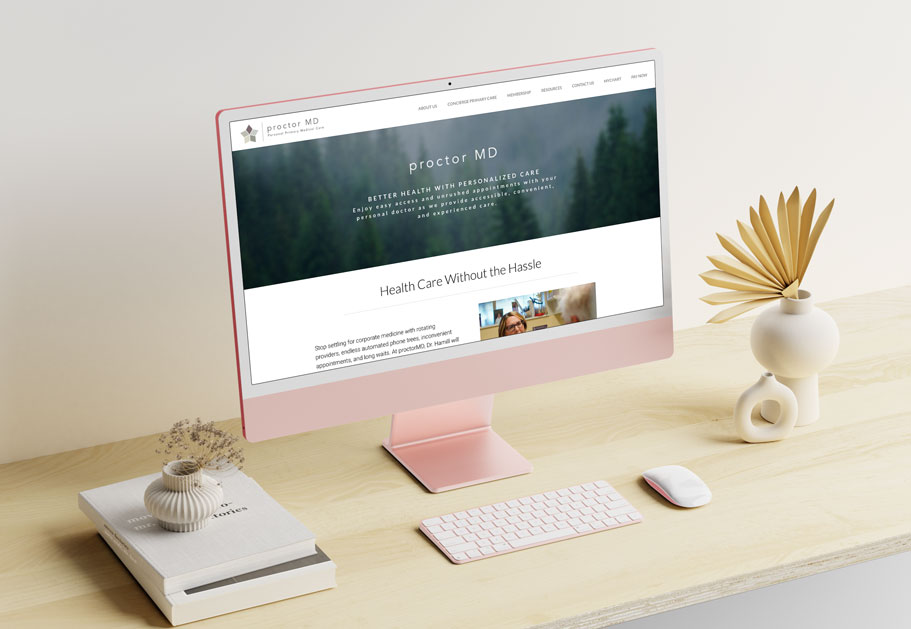
proctordMD
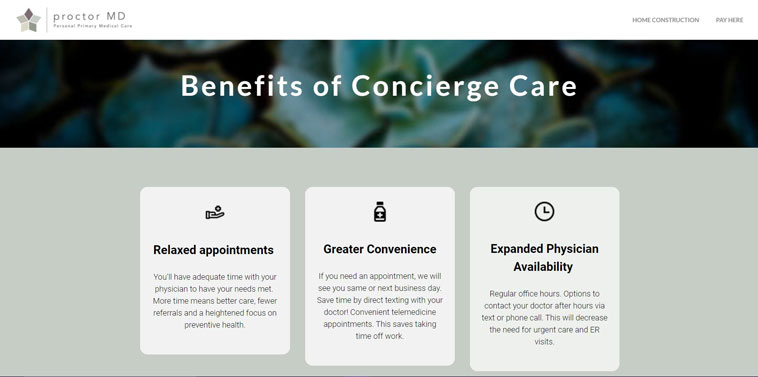
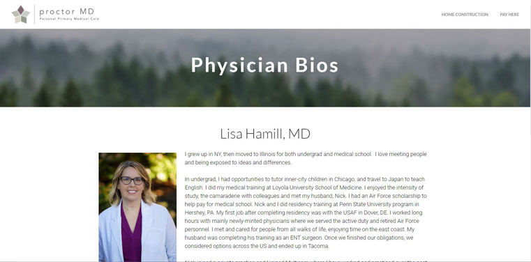
This medical practice was in need of a new website. Being based in Tacoma, Washington, they explained they wanted a lot of greenery in the website design from tree lines to other plants and that it was very important to them. They also wanted calming colors as close to their logo. During designing, I made sure to keep this natural and calming feeling as I blocked out colors and inserted some nature scenery.
Site: http://www.proctormd.com/
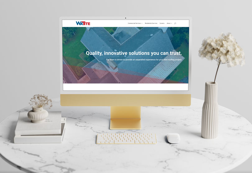
WxTite
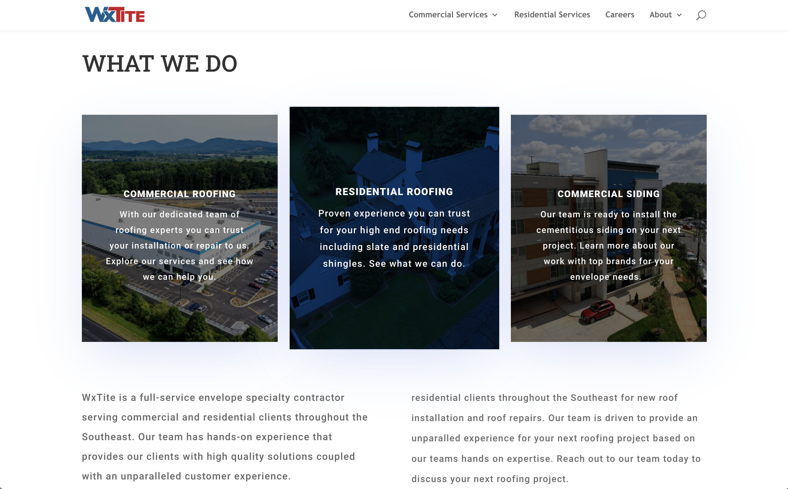
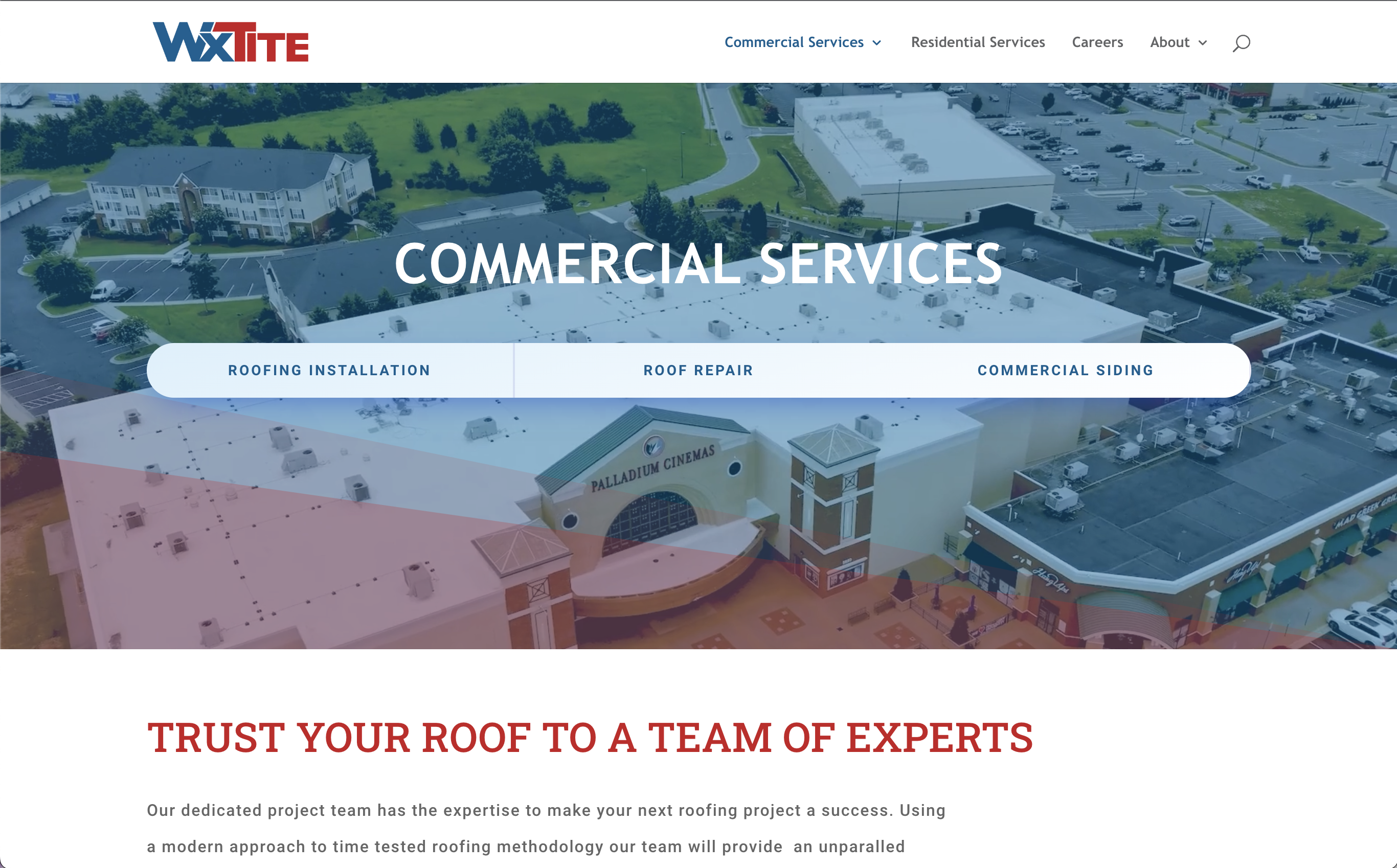
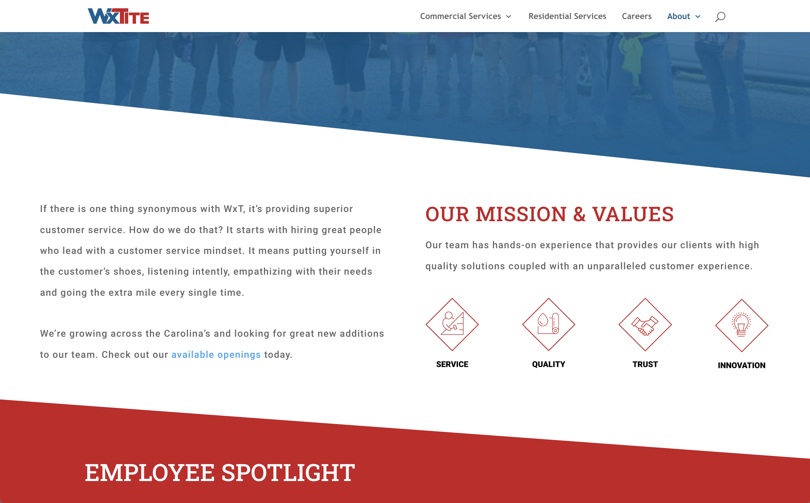
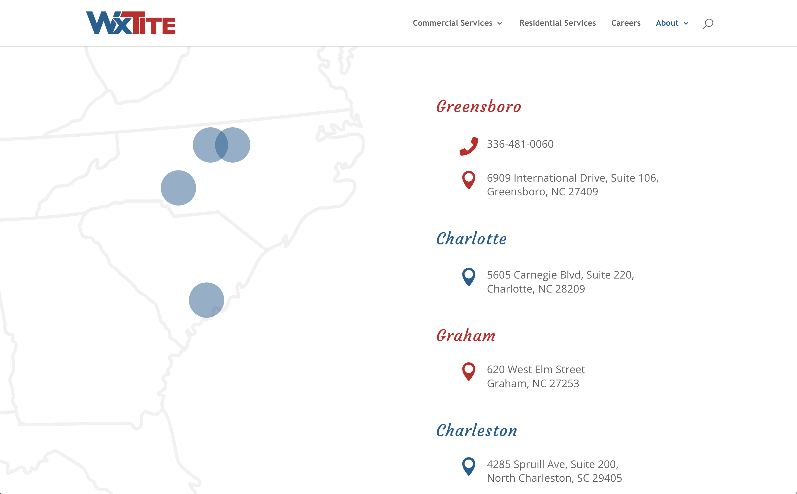
This roofing company was looking to update their website's appearance and organization. Being a part of the Samet Corp. family, we pulled just a couple of colors of red and blue from their branding to implement on the roofing site. The use of angles matched the parent company, while also alluding to the idea of a roofing company with the slants.
Site: https://wxtite.com/
Smoak's Comfort Control
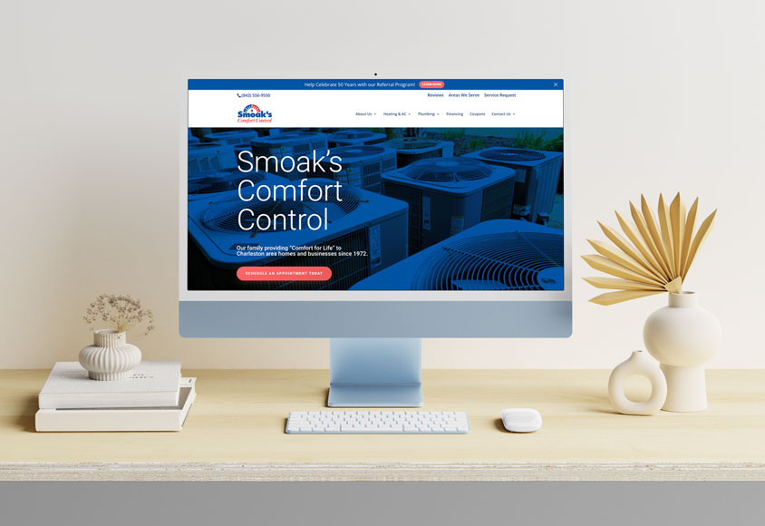
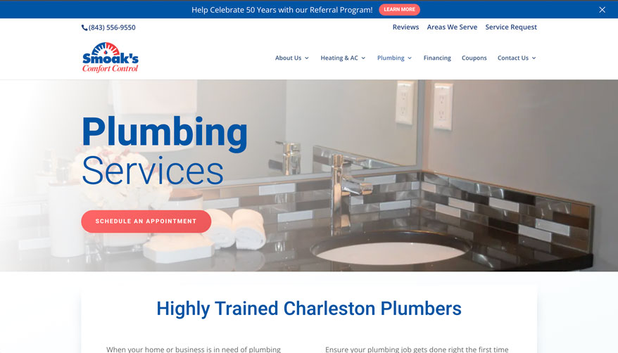
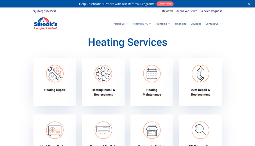
Smoak's Comfort Control was one of the first sites where I was working on the site with an intern. Together we helped Smoak's Comfort Control re-design their site. I helped complete the rest of the site when the internship was over, making last minute design changes and edits.
Site:https://smoakscomfort.com/
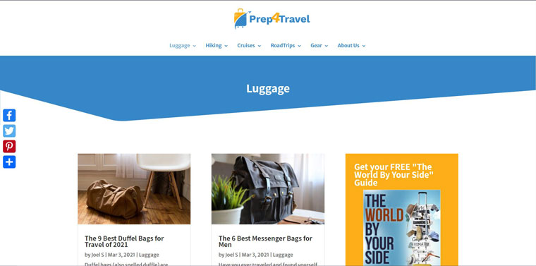
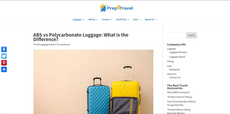
Prep4Travel
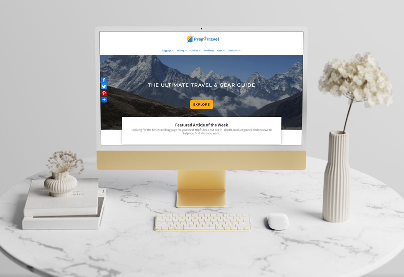
Prep4Travel is primarily a blog type of site where the owner recommends certain types of luggage, offers tips on traveling, and more. So, I had to keep in mind he had to easily be able to edit the site on his own after I finished designing it. I made sure I used the right sort of blog features that he would understand and made basic templates for him to get an idea how it would appear. Design wise, I kept everything pretty straightforward and stuck to the blue and yellow of his logo.
Site: https://prep4travel.com/
Illustration
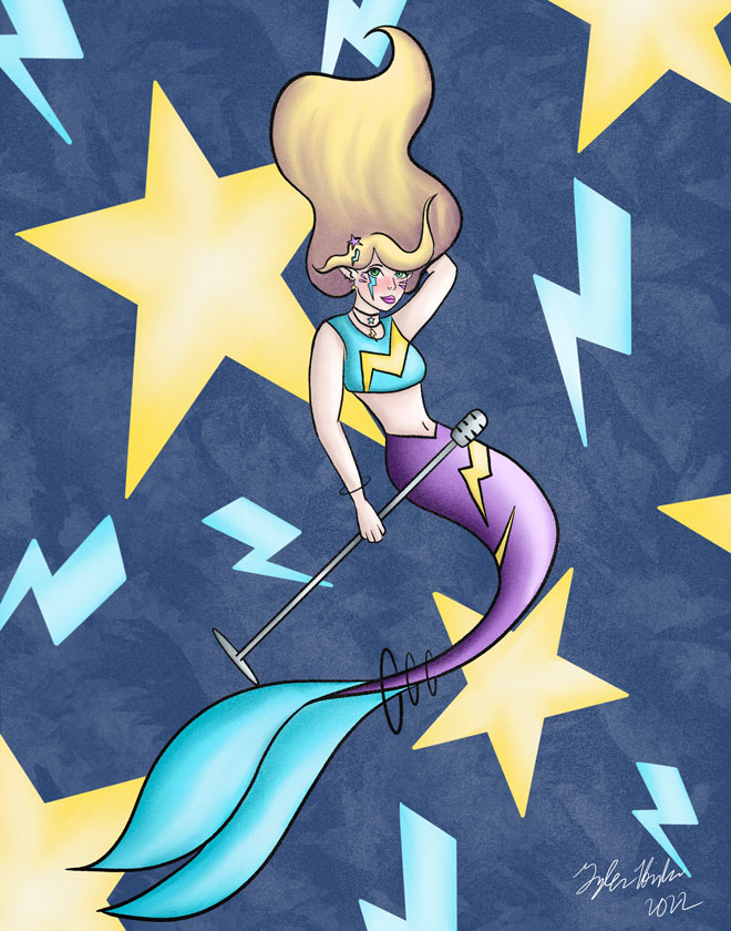
SuperStar Mermaid
I like to particiate in many art challenges as much as possible. This one in particular was from MerMay 2022, and the word was "Superstar." I figured it'd be fun to do a pop style mermaid with lots of bright colors.
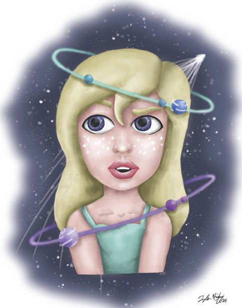
Space Girls Trio
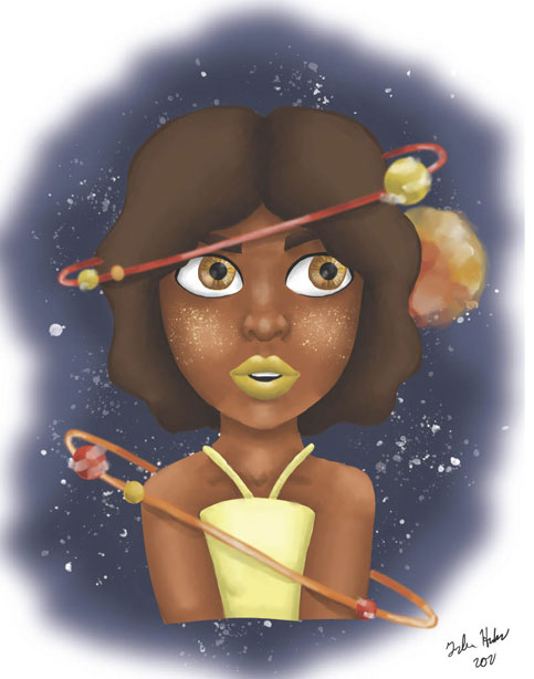
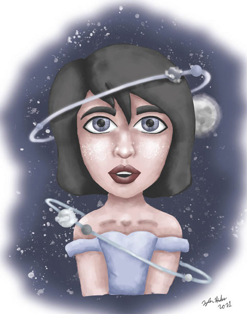
I enjoy space a lot as well, just the beauty of the stars and galaxies. I also enjoy orbits or halos that wrap around things when I design, so I created space girls trio. I based each girl off a different item you can find in space, from the sun, moon, and a shooting star. I challenged myself to keep a similar digital painting style throughout the three images.
The Huntress + The Hunter
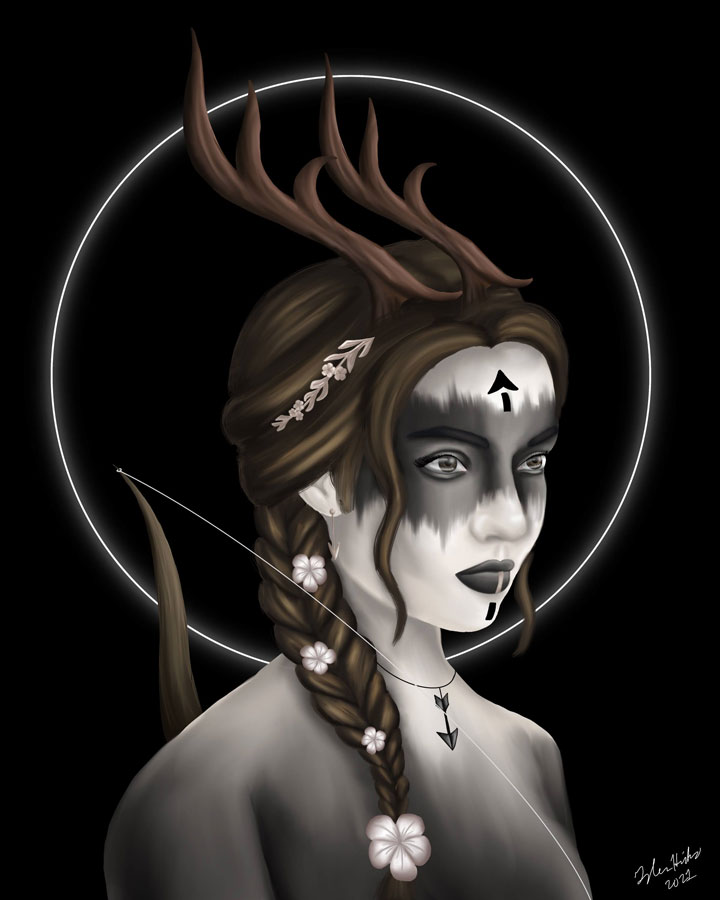
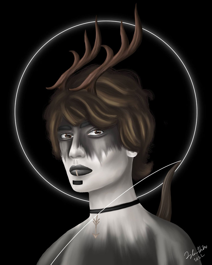
The concept started with just The Huntress, inspired by a moodboard I had found on Pinterest. Using inspiration of elements form the moodboard, such as the coloring, and the elements such as arrows and flowers, I had created the Huntress. I then created her counter part, mimicking the style I drew her in as I drew the guy.
New Life Baptist Fall Festival Ad
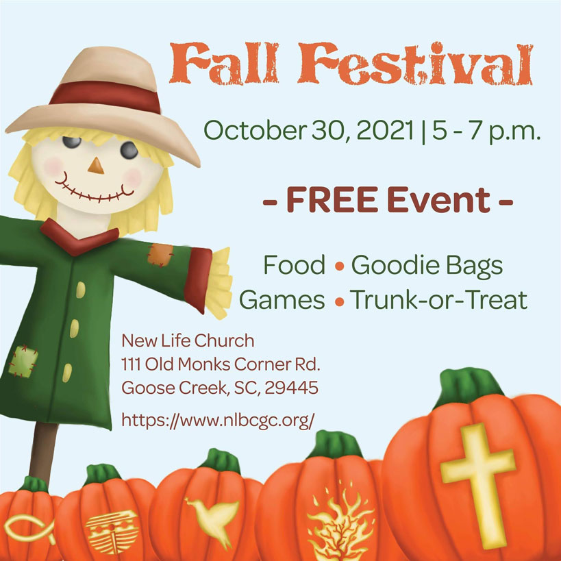
The church I had been attending were in need of some Facebook Advertisements for their yearly Fall Festival. I was asked if I could use my skills to create the ad, so I came up with a few concepts, combining elements of halloween and fall with church and Christ. A friendly little scarecrow to welcome the new people in a pumpkin patch, in which I had "carved" spiritual icons into them.
If I was A Witch...
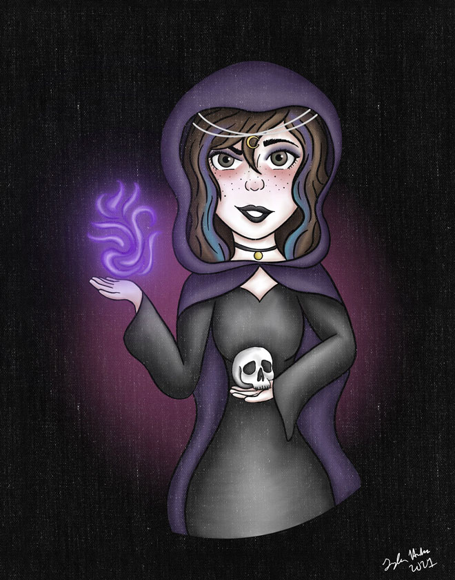
During Halloween of 2021, I wanted to play around with my icon character of myself that I use for my brand and make a witch out of her. This I then used for my icon on my social media through the month of October. I knew I didn't want to go with the stereotypical pointy hat, so I sent with a deep purple cloak and a headband in my design. I used a texture brush as an eraser to make the more canvas-like look to my image.
Character Art
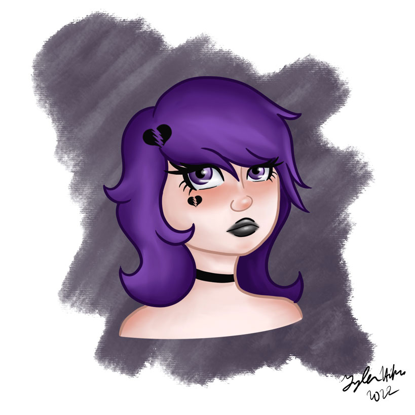
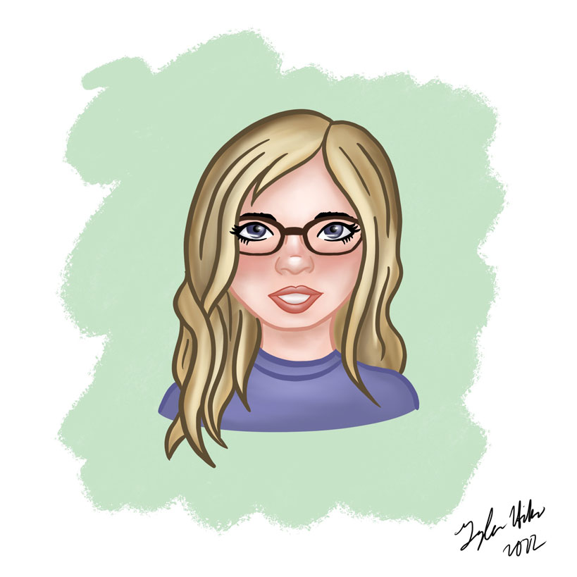
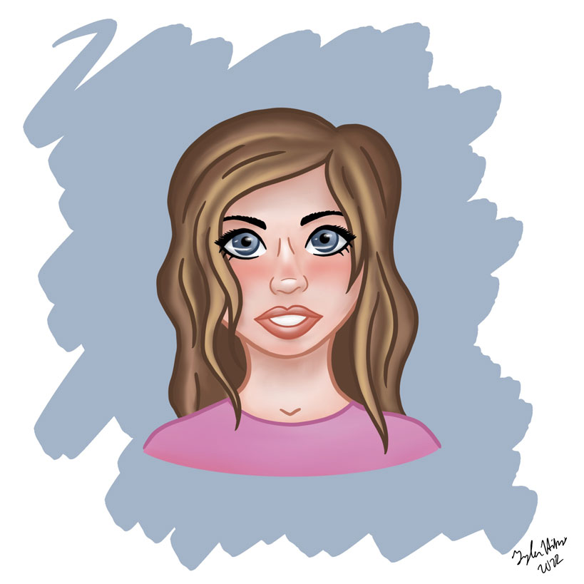
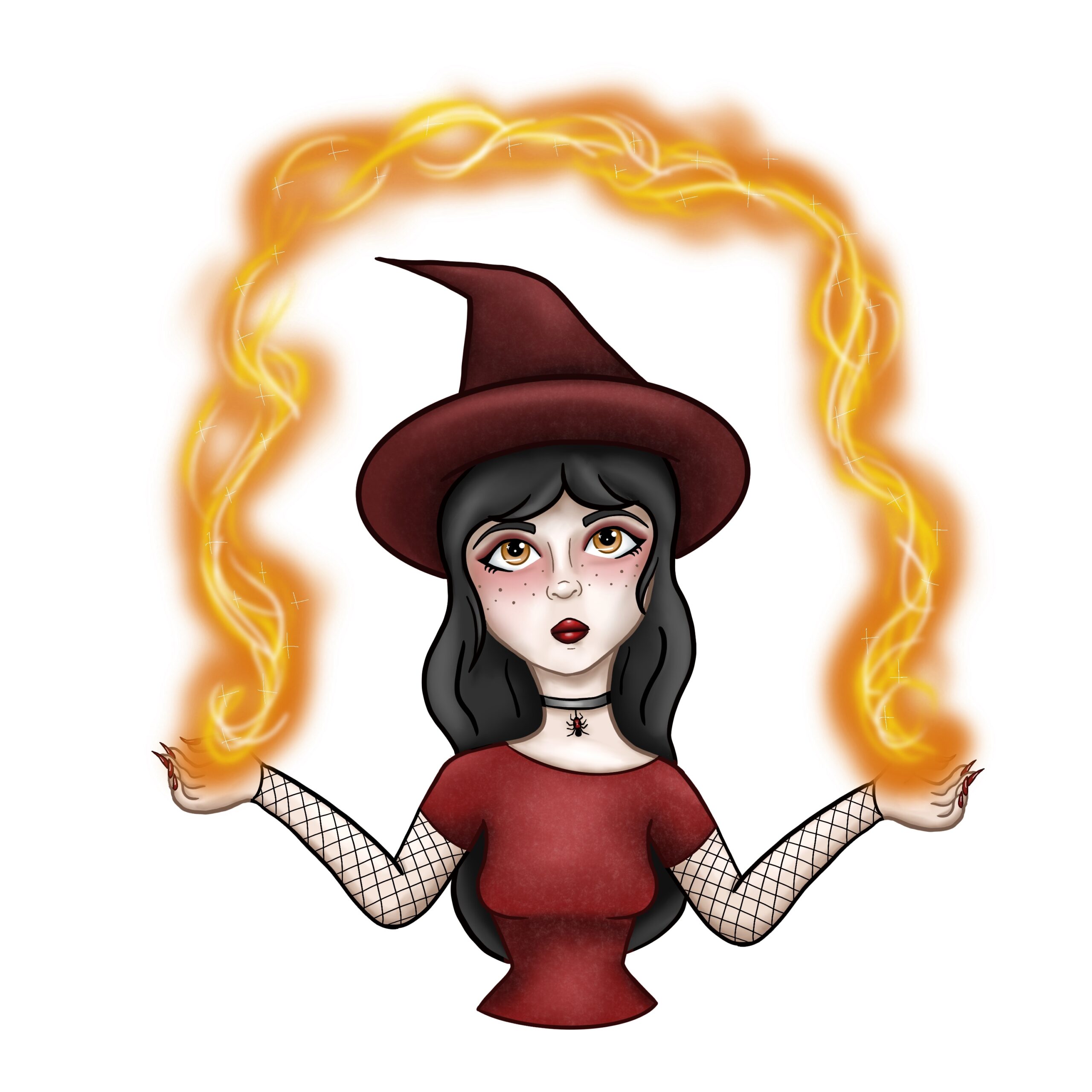
These are a variety of character portraits I have done in practicing my preferred character art style. I have two portraits I made of my friends, an Anti-Valentine girl, and a cute pyro witch. I like doodling big eyes for my characters and doing blush under the eyes and across the nose.
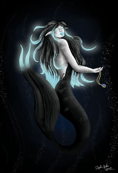
Bioluminescent Mermaid
As if it isn't obvious by my personal brand, I love mermaids and the ocean. I especially like learning about the deep sea, which has barely been studied. All the interesting creatures that live under there are so unique, so I wanted to make a deep sea mermaid. I based her off of the type of deep sea fish that have bioluminescent lighting to attract their prey, so I wantted her to mimic that glow effect that those fish have.
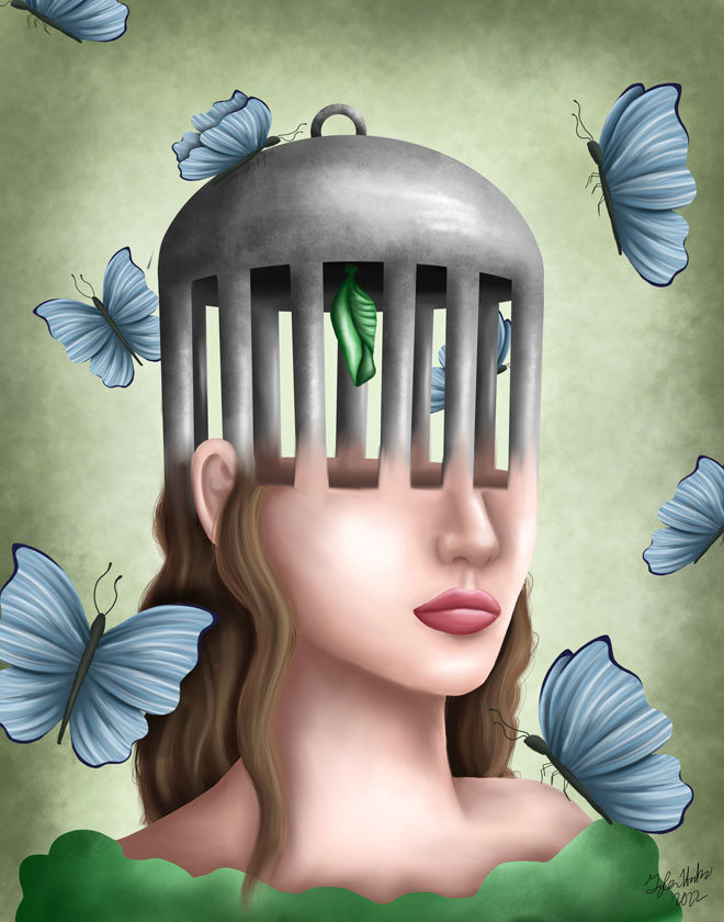
Mental Health Awareness 2022
This was my pieces for Mental Health Awareness May 2022. Mental health is very important to me and I like to try to represent it in my art. I let people interpret this as they like with the cocoon caged the woman's mind with the butterflies surrounding her.
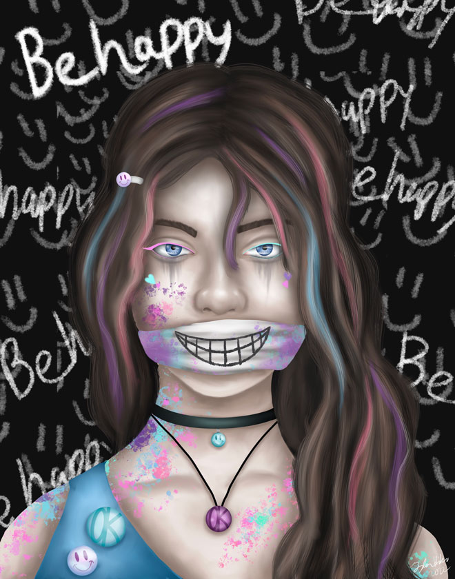
Just Be Happy
There is a song called "Happy Face" by Jagwar Twin that I enjoy. It's about mental health and how in the world sometimes it's easier to put on a happy face instead of dealing with problems and emotions, and that typically the world expects it even if you aren't okay.
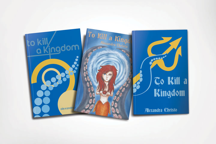
Different Style BookCovers
For this project I researched different design styles from history and then took a favorite book of mine and made a redesign in those styles. I tried to make the books cohesive in appearance through the types of colors I used and some of the themes, such as the tentacles being a repetitive item throughout the different books. My three styles I did was Bauhaus, Art Nouveau and Plakatstil.
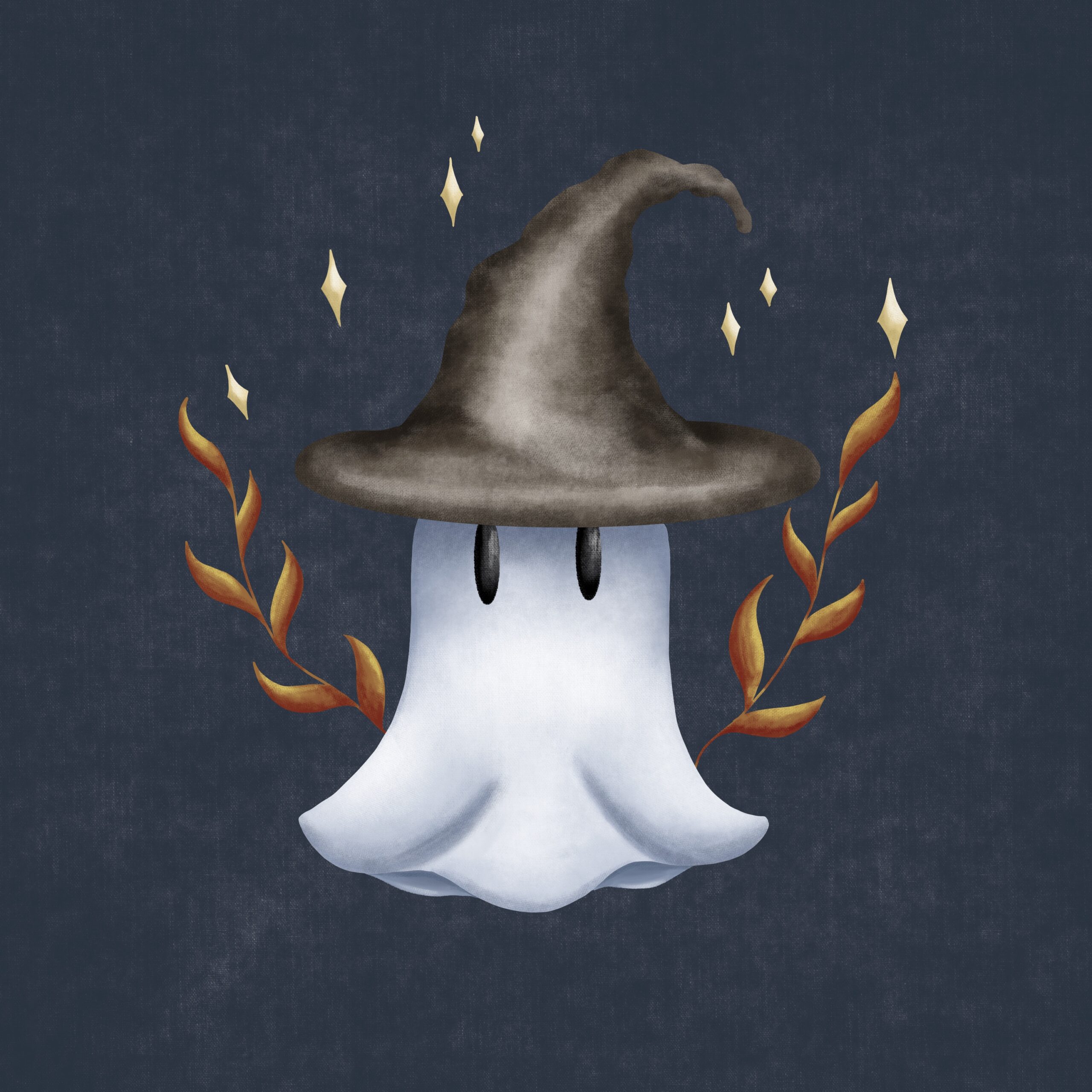
Witchy Ghost
This is an adorable little illustration I did in Fall of 2022. I love Halloween and I was so excited to try a new style with the ghost, using variety of textures on a relatively flat illustration.
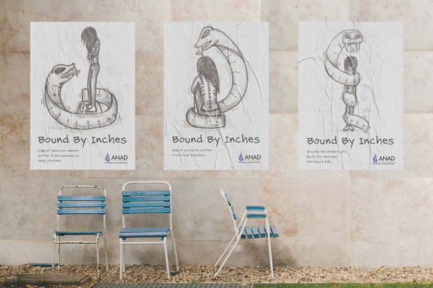
Anorexia Nervosa Awareness
I was challenged to combine my illustration skills with layout to create an awareness ad campaign for any cause of my choosing. I chose anorexia nervosa because I believed my illustration skills would be able to create a visual for this. Anorexia nervosa is an eating disorder where one limits how much they eat and they become unhealthily skinny. Often times, it's because the victim believes they are too big. With this in mind, I created an evil character of a measuring tape snake to be a heavy, overwhelming figure that traps the victim.
Beauty and the Creek
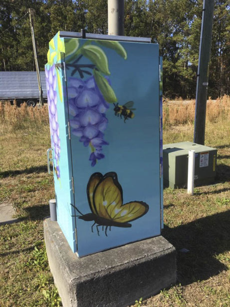
My city held a competition where the winning artists/designers would get their art printed on wraps to put on the traffic cabinets around the city in a project called “Beauty and the Creek.” Remembering the wisteria I see in my city, I took inspiration and created this illustration of wisteria with some butterflies and bees to add some contrasting colors to the purple flowers.
cozybrew coffee Packaging
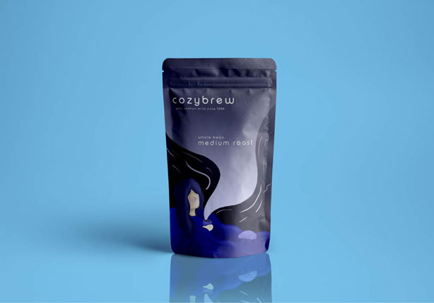
I found this mockup one day and immediately wanted to use it. Being an avid coffee drinker, I thought I'd design for a coffee brand I make up and design the package for it. So, I came up with cozybrew coffee, and as I thought of the name I knew I wanted to show a minimalistic character curled up with a cup of brew.
Dead But Pretty
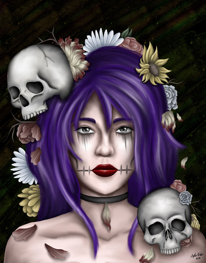
This was a trending sound on Instagram Reels for a while back in the summer/fall of 2022. It was so stuck in my head I came up with this as inspiration. Skulls are traditionally what many people first think of when they think of death, but I think flowers first when I see the word "pretty." So, I combined the two in this portrait.
Pineapple Mermaid
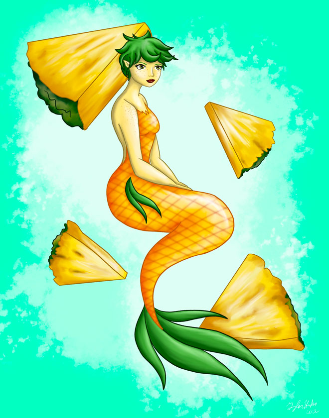
I asked followers on Instagram to give me random food ideas without them knowing why I wanted them. I meshed together pineapple with a mermaid, using colors and textures from a pineapple for each part of the mermaid, down to her brownish lip color.
Studio Art
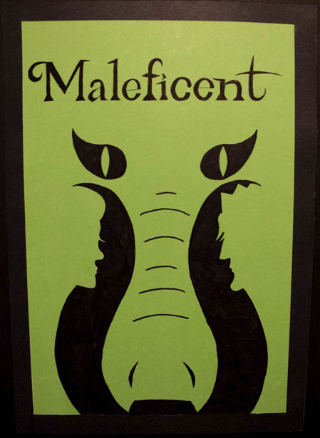
Maleficent Negative Space Poster
I was challenged to create a movie poster by hand using negative space that would be interesting. I picked Maleficent for my movie since she had some iconic imagery such as her horns and the dragon. I started with the horns since it was the most obvious feature, and I realized how the dragon's snout can form in the negative space between her horns. Adding on to push it further, I used the curves in her horns to make the profiles of the cursed princess and the king since they both play vital roles in the movie. I used green board since it matched the color of her magic.
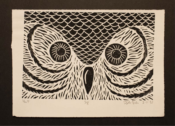
Hoot Hoot
My brother was the inspiration for this printed piece. He loves owls, it is his favorite animal. When designing the owl, I wanted a more interesting view of the owl then just an owl, so I closed up on the face of the owl in the entire frame. When carving, I made sure I kept a lot of texture behind for the feathers.
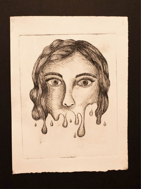
Melted Portrait
For this drypoint print, I wanted to do a portrait but not just a normal portrait. I like to think outside the box and take things in a more surreal direction, so I decided to melt the face off with heavy drips from the bottom of the nose down.
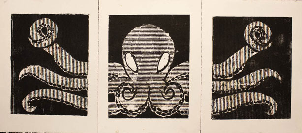
Tri-Panel Octopus
When Covid-19 hit and sent everyone home for the rest of the semester, the printmaking class had to change plans and figure out what we could do without materials. We were presented with a project where we used cardboard and other things we could find to make plates, which we sent to our professor to print for us. I used two different types of cardboard and I carved out an octopus for my tri-panel since I love the ocean and I felt his tentacles spilling over on the other two panels would look great.
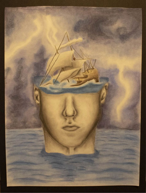
Sinking Ship
I was inspired by a few lyrics of a song to create this image. The song is "My Demons" by Starset and I took in account the first few lyrics for this visual, taking the ideas literally. I washed out my main person who is stuck in a storm in the ocean, the ship in his mind sinking.
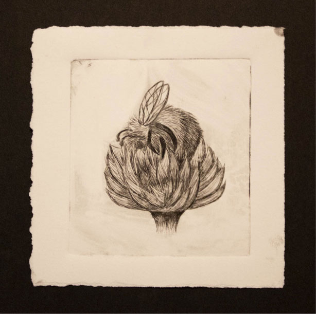
Bee Butt
For this drypoint print I wanted a different viewpoint for an insect print. This was to be my final for the insect print project and I decided to do this cute bee burried into a flower.
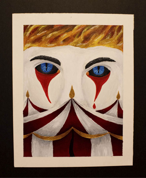
Mystery at the Circus
I was challenged to interpret a book title on my own and create an interesting book cover for it. The title I chose was Mystery at the Circus and immediately knew for a character I wanted a sort of demonic clown. After a variety of sketches, I best liked him looming over the circus tents. I used paint in this project and I used metallic gold paint to accent certain parts of the tent.
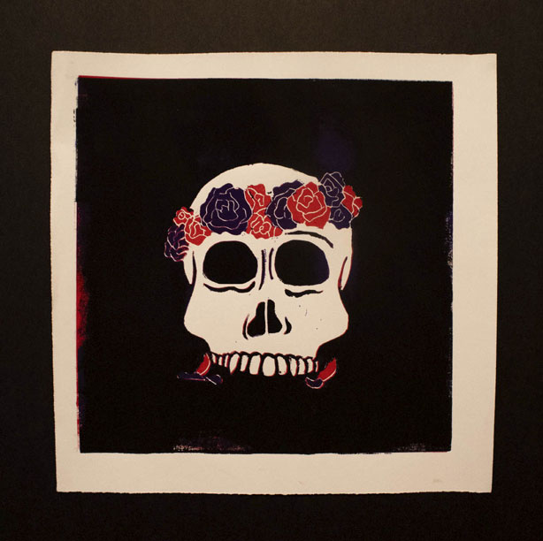
Day of the Dead
I am very interested in bones and especially skulls. I find them very interesting to draw and shape, so when it came to this multi-color print, I wanted to use a skull since it was around the day of the dead. I created a little flower crown lopsided on the head for some interest and to bring forth a pop of color in the piece, using purples and reds since they go well together and when printing the colors wouldn't have some weird color appear.
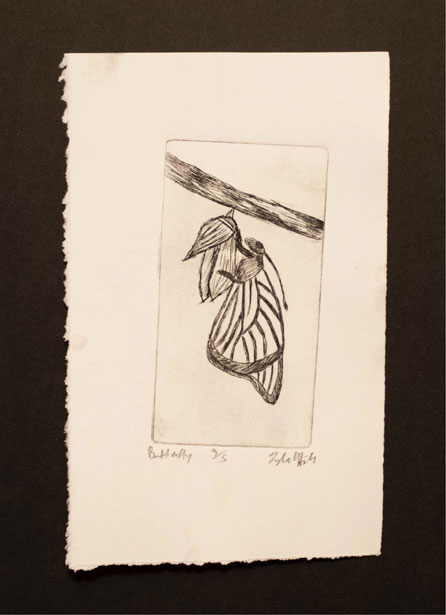
Butterfly Print
For this drypoint print I wanted a different viewpoint for an insect print. This was actually a practice to see how drypoints worked, but I attempted serveral prints of a butterfly coming out of a cocoon.
